Zes Kiosk: Designing the On-Device Experience for Türkiye's National EV Charging Network
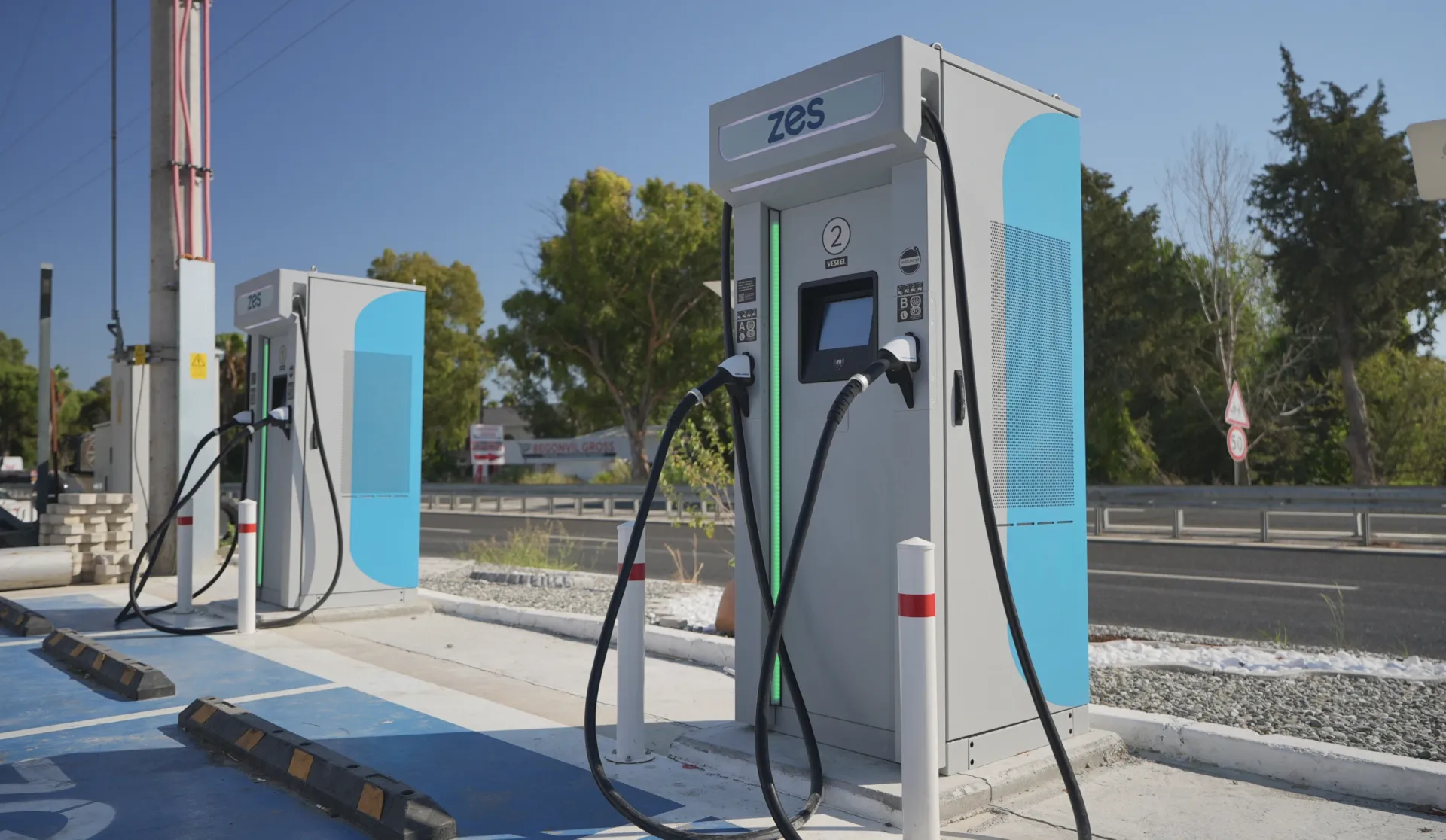
UX and UI design for the touchscreen interface embedded in Zes high-power charging stations, deployed across 81 provinces of Türkiye.
Zes operates Türkiye's largest EV charging network, with stations deployed across 81 provinces. The kiosk UI is the moment where the network's scale becomes a personal experience: every driver who pulls up to a Zes station interacts directly with the touchscreen interface Blurple designed. The goal was a session flow that is fast, error-free, and legible at arm's length, in bright sunlight and underground parking garages alike.
A high-power charging station serves dozens of drivers per day, in every weather condition, in a wide range of lighting environments, and with no instruction manual. The interface has to work for a first-time EV driver who has never used a fast charger, and for a fleet manager who uses the station twice a day. It cannot rely on onboarding, tooltips, or user support. Every state of the charging session must be communicated clearly and immediately.
A complete kiosk UI covering the full charging session: idle state, socket selection, authentication (RFID, QR code, credit card), active charging with live telemetry (power, voltage, current, energy, time), and session end. The interface is deployed on Zes stations across Türkiye and updated continuously through the ongoing design partnership with blurple studio.
The Challenge
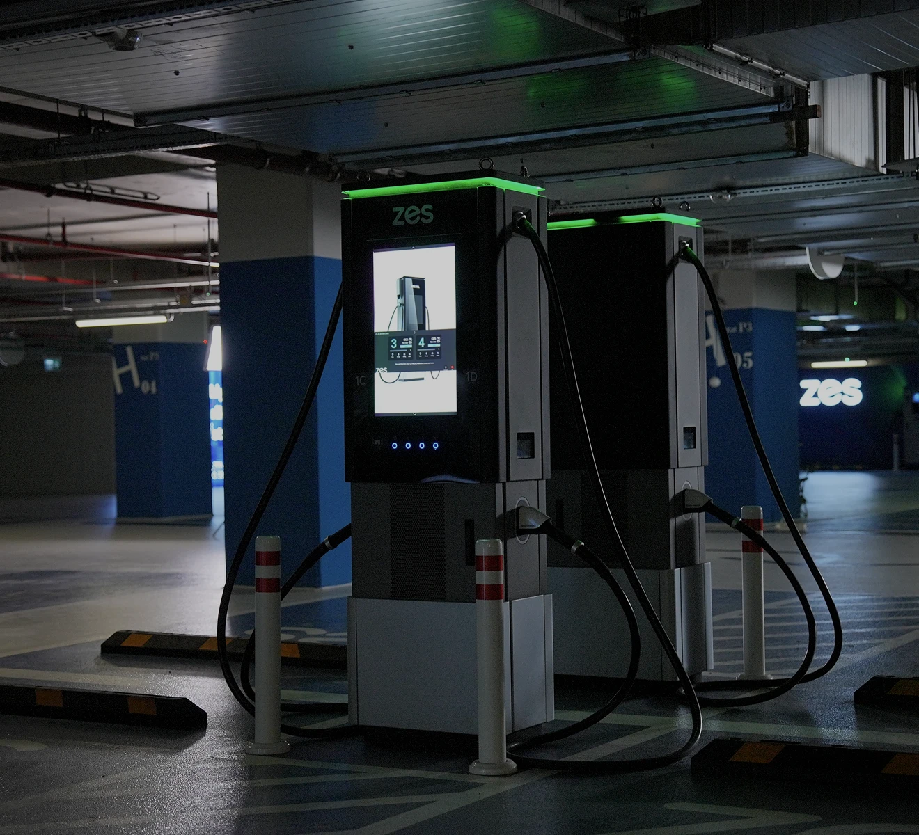
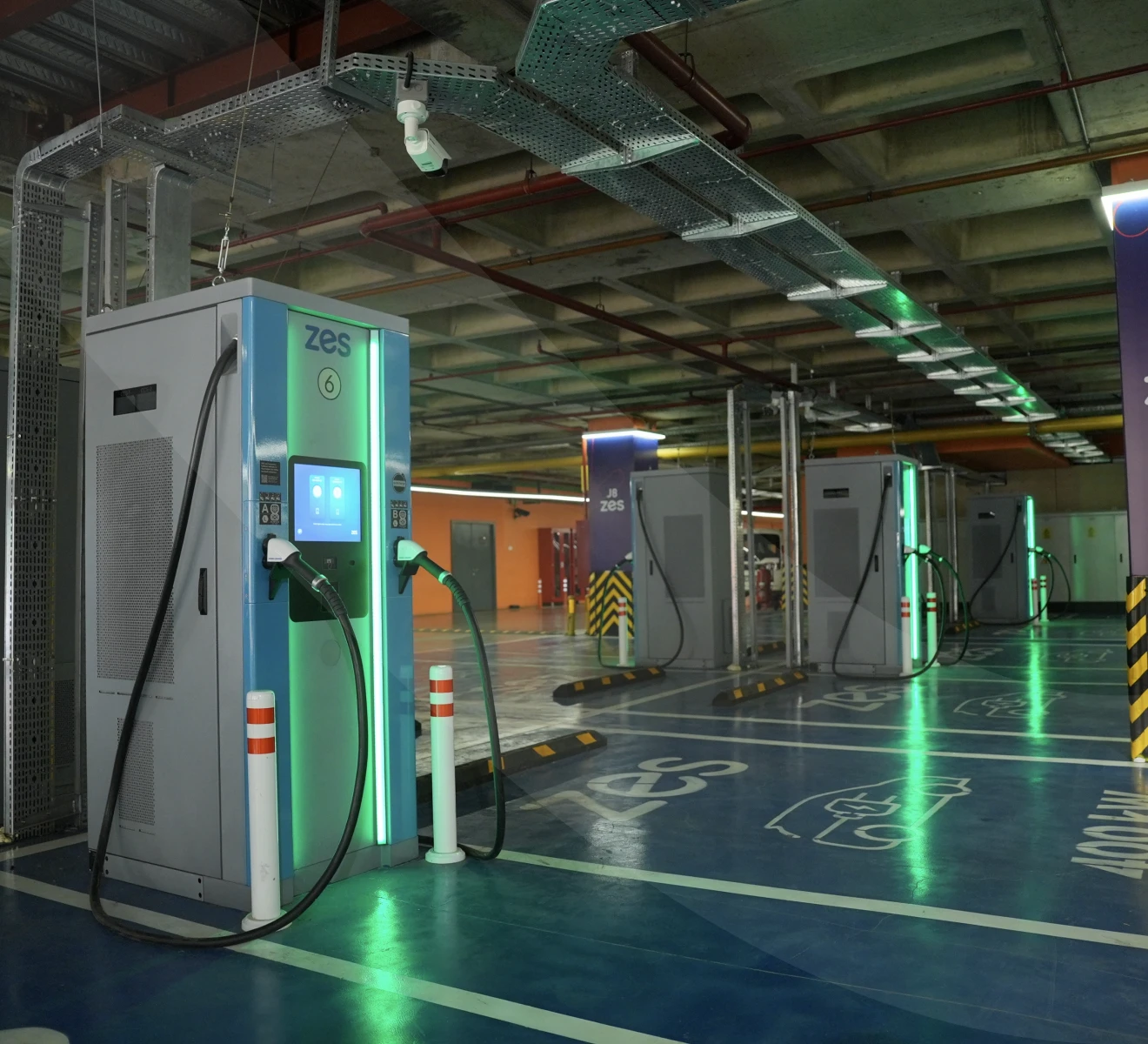
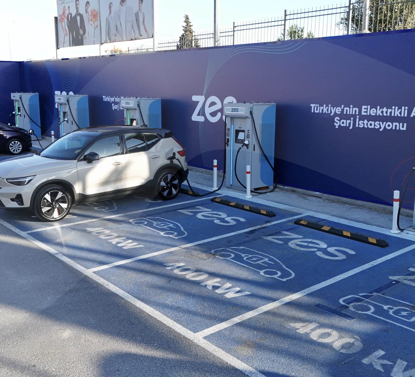
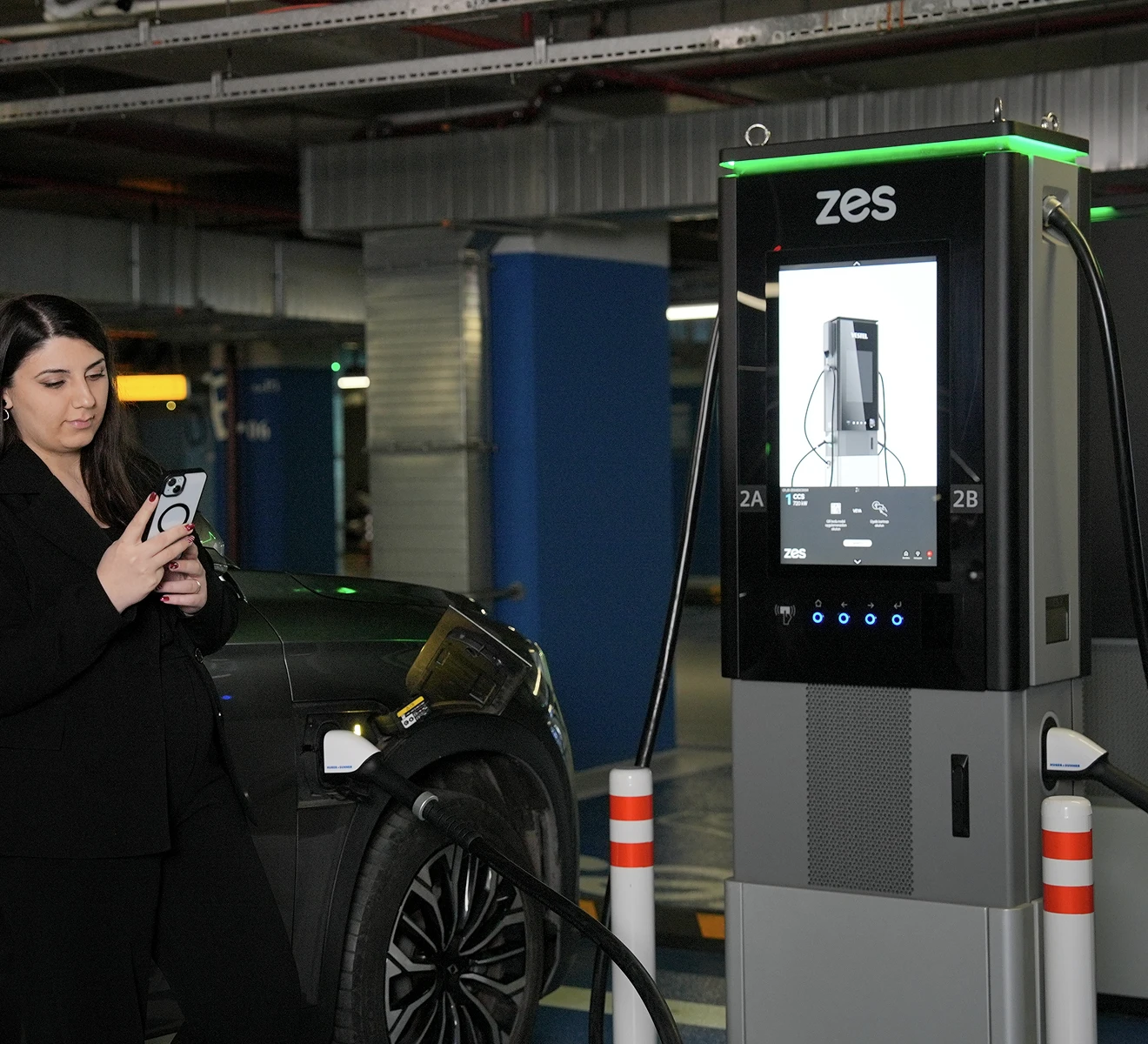
A Zes charging station is not a controlled environment. It is a roadside kiosk, an underground parking facility, a motorway service area. The screen is read by drivers holding a phone, standing at a distance from the unit, in sunlight that washes out contrast and in darkness where the screen is the only light source. The interface has to be legible, operable, and reassuring in all of these contexts simultaneously.
No room for confusion at 720 kW. Zes HPC stations deliver up to 720 kilowatts of charging power, DC CCS, across two simultaneous charging ports. At this power level, a driver who selects the wrong port, or does not understand the authentication step, creates a delay that affects everyone behind them in the queue. The UI had to eliminate ambiguity from every step of the session flow.
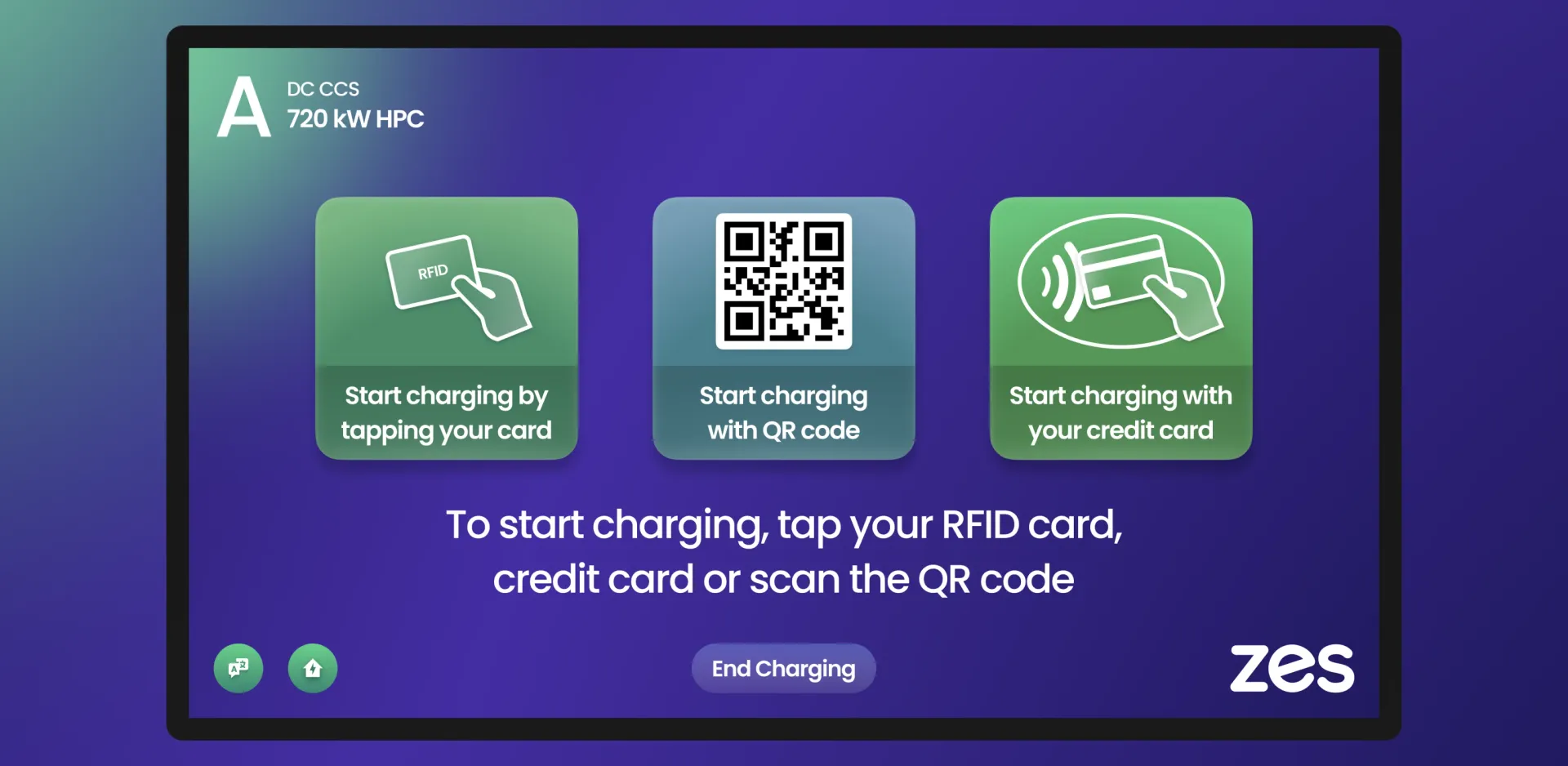
Three authentication methods, one coherent screen. Zes stations support RFID card tapping, QR code scanning, and direct credit card payment. Each method reaches a different type of user: Zes members use RFID, new users scan QR, guests pay by card. All three needed to be presented clearly on a single screen, without any method feeling secondary or hidden.
Real-time data that drivers actually need. During an active charging session, EV drivers are not watching the screen continuously. They are in their vehicle, in a nearby café, or standing beside the car. The active charging screen had to present the critical information (current power draw, state of charge, time remaining) in a way that is readable at a glance from a distance, at any point in the session.
 Zes Kiosk: Designing the On-Device Experience for Türkiye's National EV Charging Network · The Challenge
The Solution
The Zes kiosk UI was designed around a single principle: every screen in the charging session must communicate what to do next without any text the user has to read to understand. Icons, large labels, and spatial logic carry the meaning. Text confirms it.
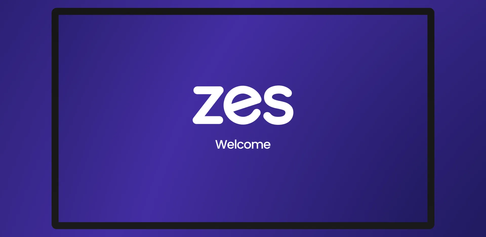
Welcome state as ambient brand. The idle screen is a full-bleed Zes brand moment: the logo centered on a deep purple gradient with "Welcome" beneath it. It is visible from a distance, clearly identifies the station as a Zes unit, and does not require any interaction to dismiss. When a user approaches, the session begins.
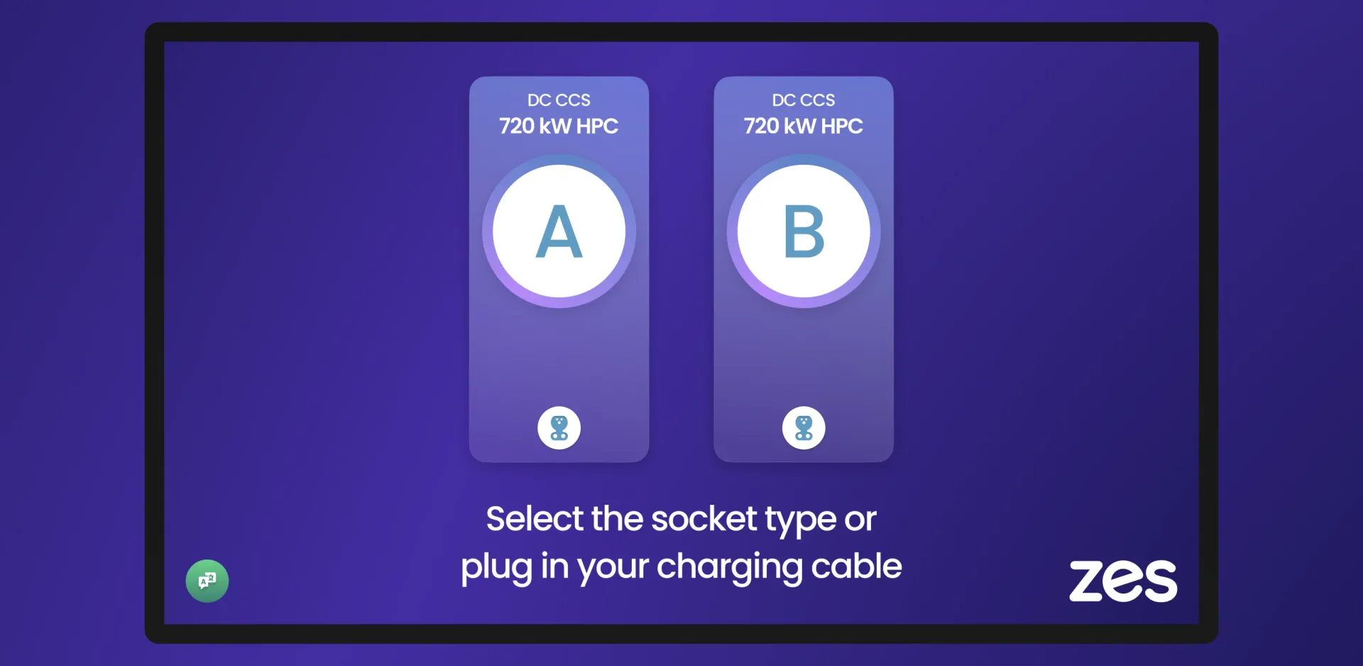
Socket selection designed for confidence. The socket selection screen presents port A and port B as two large, equal-weight touch targets occupying the majority of the screen. Each port shows its connector type (DC CCS) and power rating (720 kW HPC). The instruction at the bottom provides two ways to advance: touch the screen or connect the cable. Either action works.
Authentication: three paths, one decision point. RFID card tap, QR code scan, and credit card are presented as three equal tiles, each with a clear icon and a single-line description. The tiles are large enough to operate with one hand. The instruction at the bottom reinforces all three options. No method is buried in a submenu or requires a second screen to access.
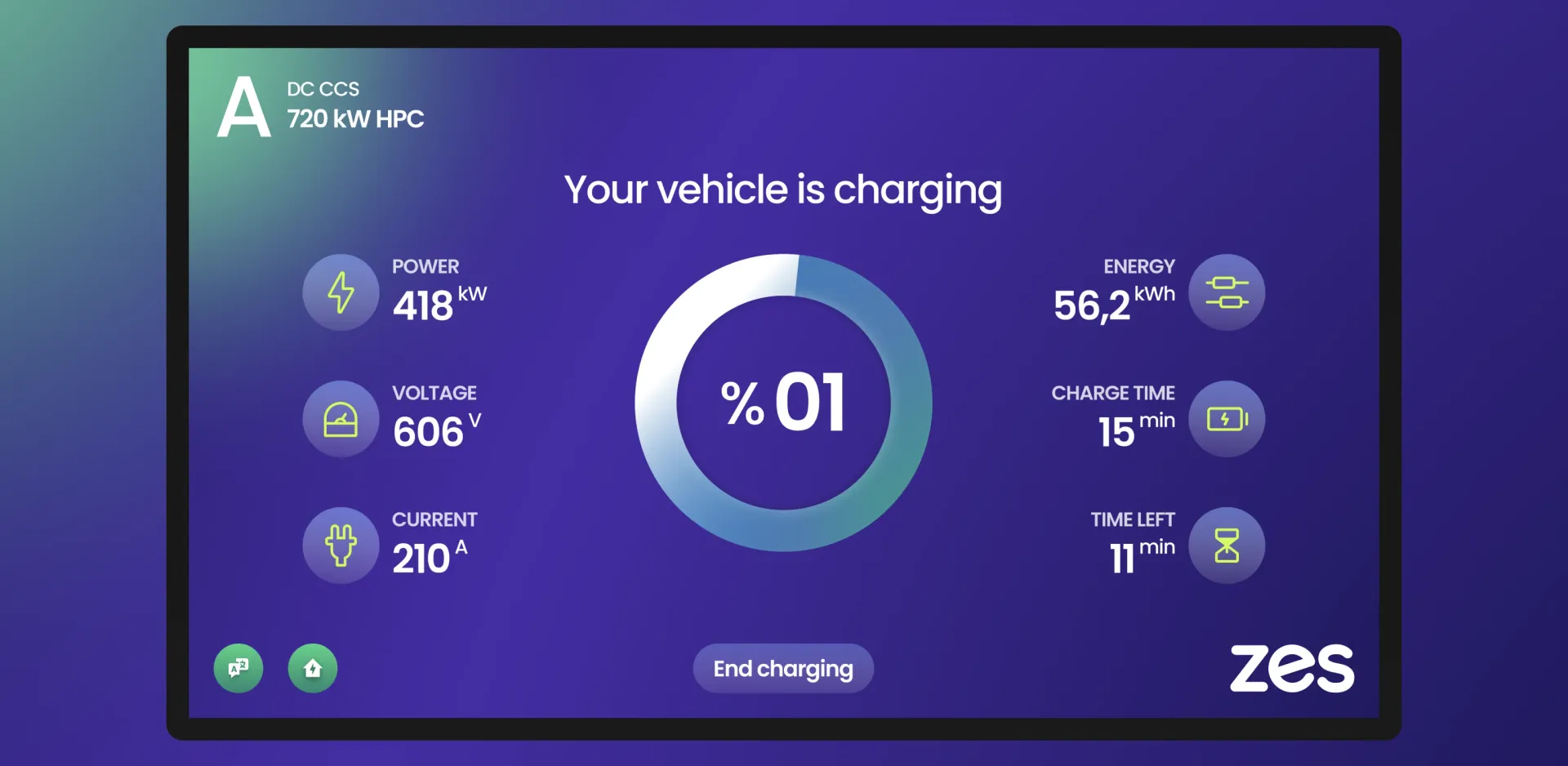
Active charging: live telemetry, clear hierarchy. The charging screen leads with the session state ("Your vehicle is charging") and the port identifier. Live power (kW), voltage (V), and current (A) are displayed on the left. The central donut shows state of charge as a percentage. Energy delivered (kWh), charge time, and time remaining are on the right. The "End charging" button is persistent throughout the session.
 Zes Kiosk: Designing the On-Device Experience for Türkiye's National EV Charging Network · The Solution
Experience Highlights
Welcome / Idle
The idle state is a full-bleed Zes brand screen: logo centered, "Welcome" beneath, deep purple gradient. It is readable from the distance a driver would see the station while approaching the bay. No animation, no content carousel. Just the brand and a clear signal that the station is online.
Socket Selection
Port A and Port B appear as two tall rounded tiles, each containing the port letter in a large circle, the connector type (DC CCS), and the power rating (720 kW HPC). The layout is symmetric and touch-target-first. A driver can tap their port before they have finished reading the screen label. Plugging in the cable also advances the session automatically.
Authentication
Three tiles at equal size: RFID card tap, QR code scan, credit card tap. Each tile shows an icon at the top and a single-line label. The summary instruction at the bottom unifies all three options into one readable sentence. The End Charging button is visible even at this pre-session stage, providing an exit path for drivers who change their mind.
Active Charging
The charging screen is designed to be read from inside the vehicle. Power output, voltage, and current are shown with large numerals and unit labels on the left. The central element is a circular progress indicator showing the battery percentage. Energy delivered, elapsed charge time, and estimated time remaining occupy the right side. The layout holds its hierarchy at every point in the session, from 0% to 100%.
 Zes Kiosk: Designing the On-Device Experience for Türkiye's National EV Charging Network · Experience Highlights
Design Process
A kiosk interface has no onboarding. It cannot assume that the user has read anything about how the station works. The Experience Loop was applied to a product where the entire user experience happens in the span of a single charging session, and where every interaction failure has an immediate real-world consequence.
Focus: The north star for the Zes kiosk UI was zero-instruction operation. A driver who has never used a fast charger should be able to complete a full session without hesitation. Every design decision was tested against this standard.
Research: We analyzed the full range of deployment contexts: outdoor roadside stations in full daylight, underground parking in near-total darkness, and enclosed facilities with mixed lighting. We mapped the driver's mental model at each step of the session: what they expect to see, what they are uncertain about, and where they are most likely to abandon the session if the interface does not give them immediate confidence.
Act: The session flow was reduced to four states: idle, socket selection, authentication, active charging. No state requires more than one decision. No state has more than one primary action. The visual language (large touch targets, high-contrast iconography, deep purple with bright accent colors for active elements) was developed to perform in all deployment contexts.
Measure: Session completion rate, time-to-charge-start, and authentication method distribution are the primary metrics. The three-tile authentication screen was designed to make all three methods equally accessible, with no one method dominating user behavior by default.
Evolve: The Zes kiosk UI is maintained through an ongoing design partnership. New station hardware, new payment integrations, and network feedback are incorporated continuously. The design system built for the kiosk shares component logic with the Zes mobile app and website, keeping the brand experience consistent across all three touchpoints.
 Zes Kiosk: Designing the On-Device Experience for Türkiye's National EV Charging Network · Design Process