Electrip Kiosk: Designing the Interface Between EV Drivers and High-Power Charging
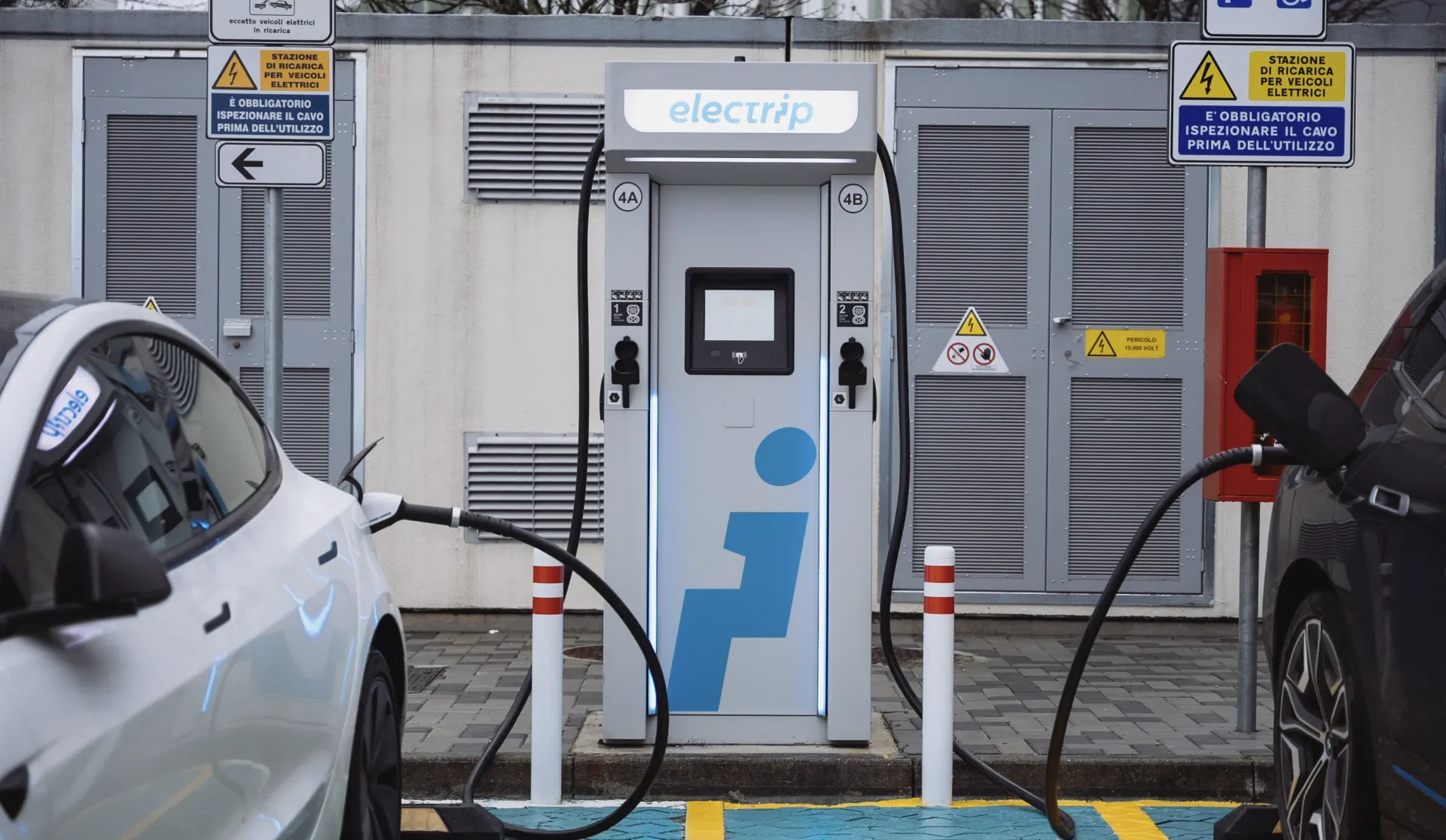
Embedded touchscreen UX for Electrip's HPC charging stations deployed across Europe.
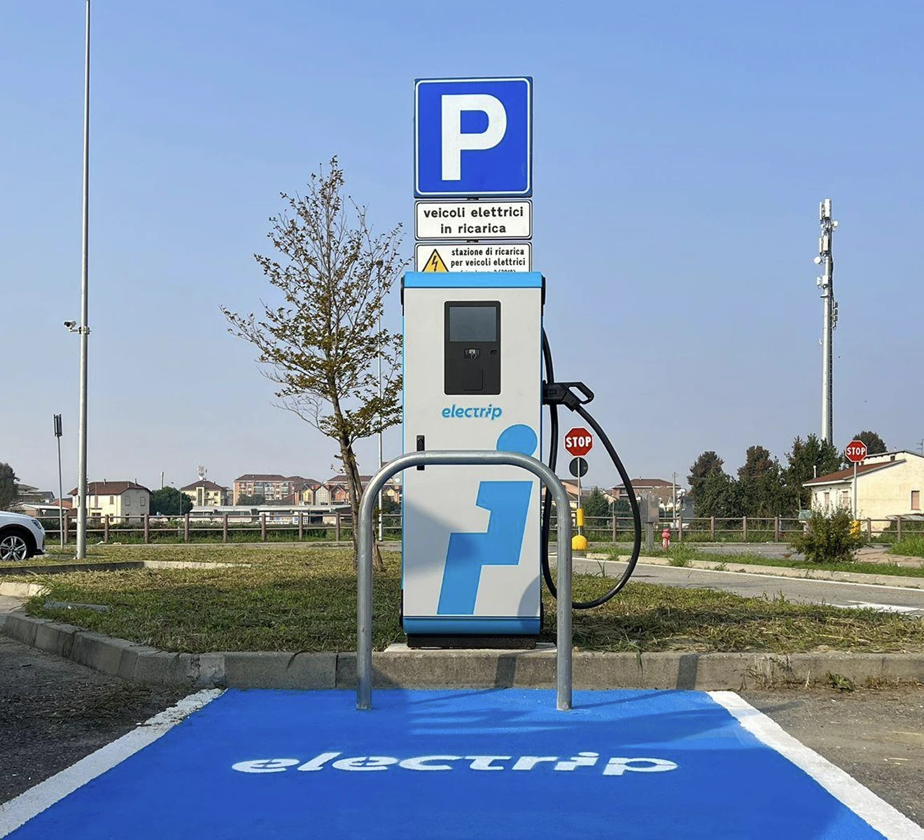
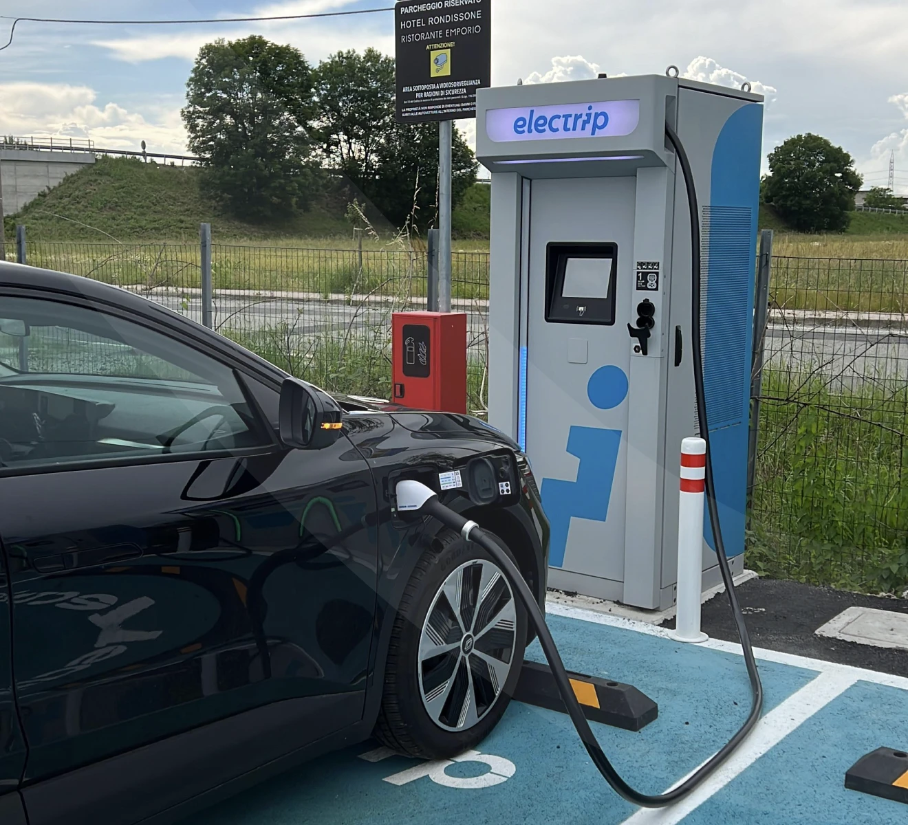
Electrip runs high-power charging stations across seven European markets. Every station carries an embedded touchscreen kiosk, and every driver who stops to charge must navigate it. Blurple was brought in to design the kiosk interface as part of the ongoing Electrip design retainer, creating a touchscreen experience that works across seven markets, in all weather conditions, for drivers who have never used Electrip before.
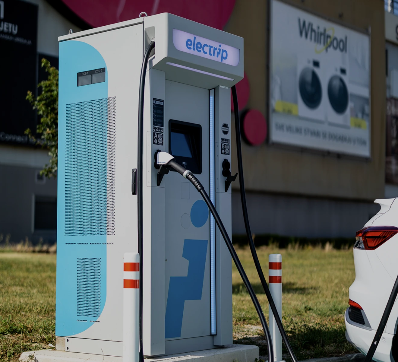
A kiosk screen is not a phone. It lives outdoors in sun, rain, and cold. It is operated by drivers in a hurry, sometimes wearing gloves, standing at arm's length from a small ruggedized display. And unlike software, once a kiosk interface ships to the field, updates roll out slowly — the core flow had to be right before it deployed.
A three-step charging flow now runs on Electrip HPC stations across Italy, Greece, France, Poland, Bulgaria, Croatia, and beyond. Designed so a first-time driver can start a session without help. No instruction manual required.
The Challenge
A charging station is not a phone. The kiosk lives outdoors, exposed to sun glare, rain, cold, and users wearing gloves. The screen is small, ruggedized, and embedded in hardware that cannot be updated as easily as software. And the users, arriving from seven different European markets, speak different languages and carry different expectations.
The hardware constraint. The Electrip kiosk screen is compact by necessity. Every element had to be legible from a standing position, in direct sunlight, by drivers in a hurry. Typography size, contrast ratios, and touch target sizing were not aesthetic choices. They were functional requirements.
The zero-margin context. A driver who cannot figure out how to start charging in the first 30 seconds will leave. The kiosk experience had to be so clear that a first-time EV driver, with no prior exposure to Electrip, could complete a session without assistance.
Multi-market deployment. The same kiosk hardware deploys across Italy, Greece, France, Poland, Bulgaria, Croatia, and more. The interface had to work across languages and user behaviors without branching into separate design systems.
 Electrip Kiosk: Designing the Interface Between EV Drivers and High-Power Charging · The Challenge
The Solution
We reduced the entire charging experience to three steps that any driver can complete in under a minute.
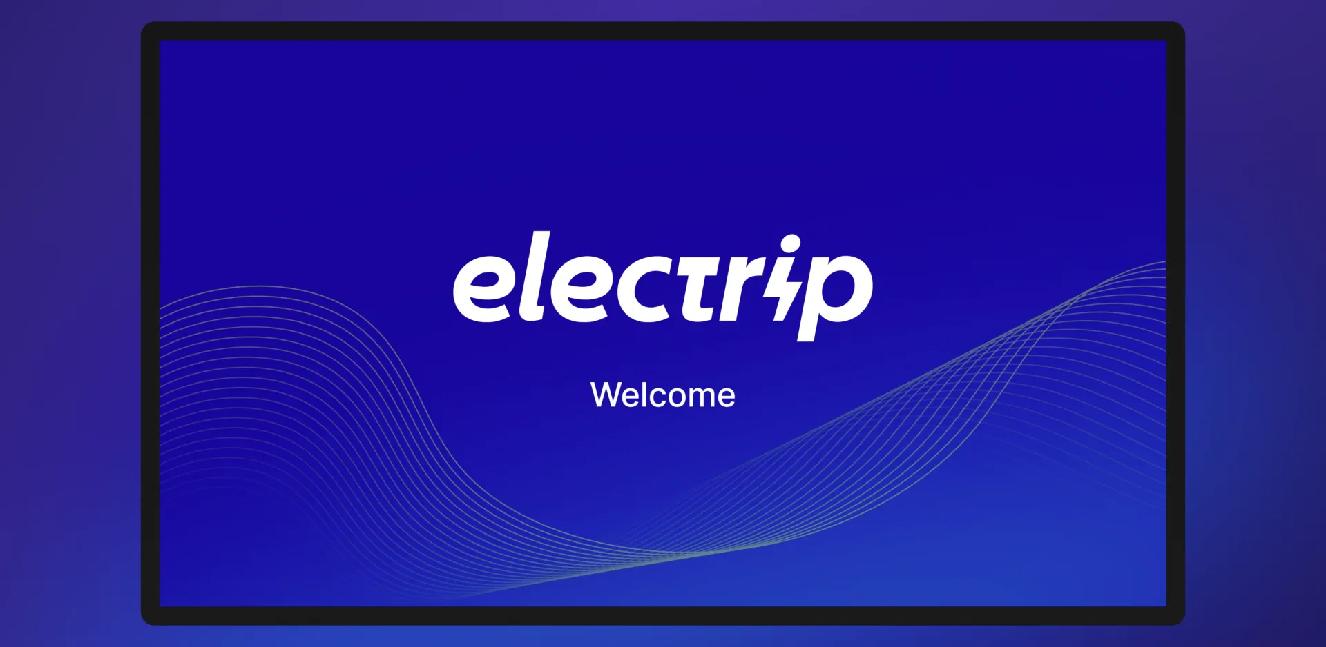
Welcome and idle state. When no driver is present, the kiosk displays a clean welcome screen with the Electrip logo against a deep blue background. This serves as both brand presence and a clear signal that the station is available and functional.
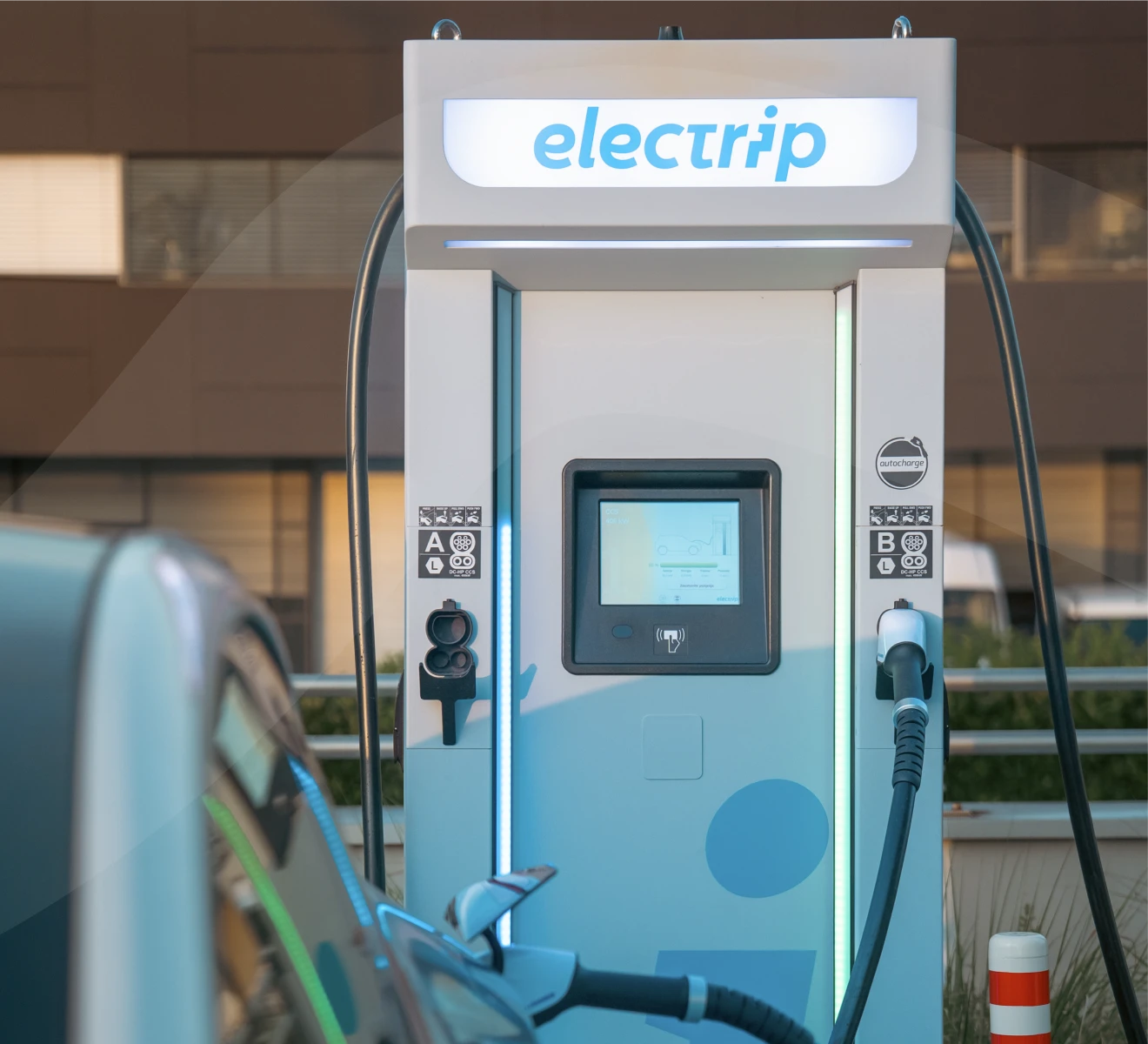
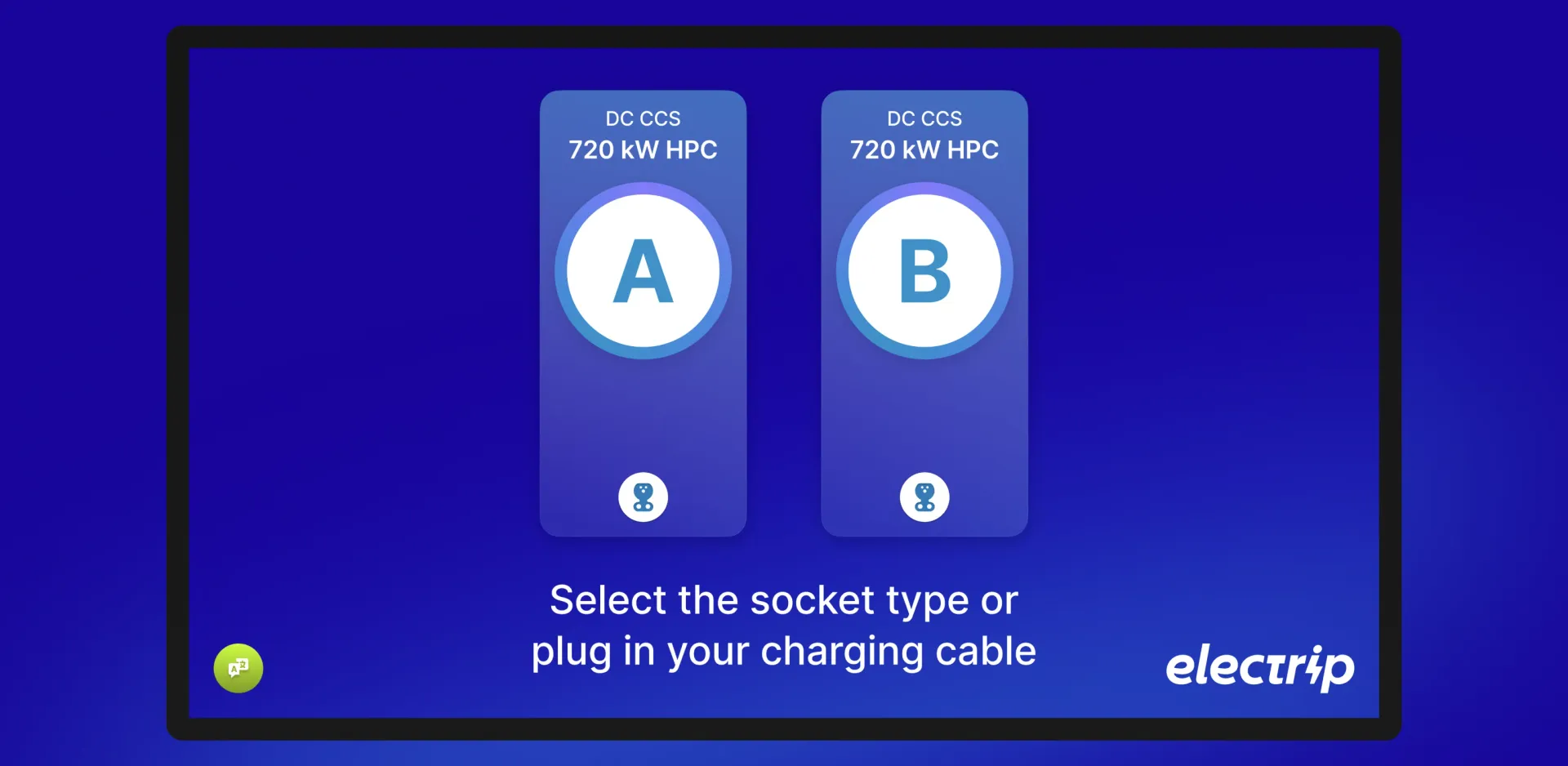
Socket selection. The first active step presents the available connectors (A and B) as large, clearly labeled cards with the connector type and power level (DC CCS, 720 kW HPC). The instruction is a single line: select the socket type or plug in your charging cable. No jargon. No unnecessary steps.
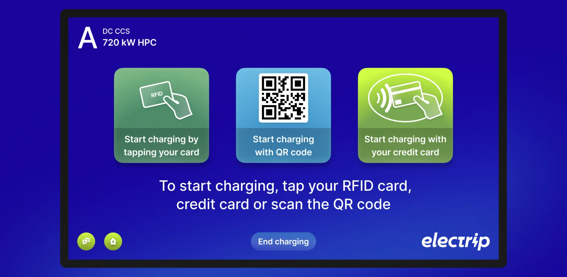
Authentication and payment. Three options are presented with equal visual weight: RFID card tap, QR code scan from the Electrip app, or contactless credit card payment. The layout is glove-operable and designed for one-handed use.
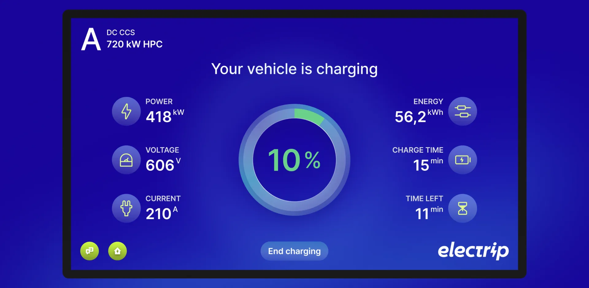
Active session monitoring. Once charging begins, the screen becomes a live dashboard: charge percentage, power draw (kW), voltage (V), current (A), energy delivered (kWh), charge time elapsed, and time remaining. Drivers get full transparency into the session, reducing anxiety about whether charging has started correctly.
 Electrip Kiosk: Designing the Interface Between EV Drivers and High-Power Charging · The Solution
Experience Highlights
Welcome Screen
The idle state communicates availability instantly. Deep blue background, centered logo, single word: Welcome. No confusion about whether the station is operational.
Socket Selection
Two large connector cards (A and B), each labeled with type and power. Status icons indicate connector availability. A single instruction guides the driver. The screen does one thing and does it without ambiguity.
Payment Methods
Three clearly distinct options with icon-led tiles: RFID tap, QR code, contactless credit card. Each tile is large enough to operate without precision touch. The instruction is one sentence. No Electrip account required to charge.
Charging Session Dashboard
A radial progress indicator anchors the screen. Power, voltage, current, energy, charge time, and time left are arranged symmetrically around it. An End charging button is always visible. The driver knows everything they need to know at a glance.
 Electrip Kiosk: Designing the Interface Between EV Drivers and High-Power Charging · Experience Highlights
Design Process
Designing for kiosk hardware requires a different calibration of the Experience Loop. Software products can be iterated after launch. Kiosk interfaces, once deployed in the field, are far harder to update.
Focus: We defined the primary success metric early: a driver who has never used Electrip before completes a charging session without confusion or backtracking. Everything else was secondary to that outcome.
Research: Analysis of EV driver behavior at charging sites informed the environmental constraints: sun angle and glare, typical driver approach patterns, and which steps caused hesitation. We also analyzed failure modes in existing kiosk flows from other European charging networks.
Act: We designed for the smallest viable screen size and worked outward. Touch targets were sized for gloved hands. Typography was set for legibility at arm's length. Color contrast was validated against direct sunlight conditions using a deep blue base with high-contrast white text.
Measure: Prototypes were tested with EV drivers across multiple markets to validate comprehension speed and flow completion rates. Particular attention was paid to the payment method selection screen, where driver familiarity varied most by market.
Evolve: The kiosk interface evolves alongside the broader Electrip retainer, with new authentication methods and connector types integrated as the network continues to expand across Europe.
 Electrip Kiosk: Designing the Interface Between EV Drivers and High-Power Charging · Design Process