Bringing the digital stadium experience to iOS and Android.
The web platform proved the concept. The mobile app had to take it further: turning a web-based fan experience into something a supporter could pull out of their pocket at the stadium, on the bus, or in the moment a goal is scored. The mobile app was designed to feel native to football: fast, emotional, and always on.
A fan platform on mobile has to compete with the natural rhythm of the phone: social media, messaging, live scores on other apps. Every notification, every screen, every gesture had to feel worth the interruption. The mobile app also had to carry the multi-club identity system of the web platform onto a much smaller canvas.
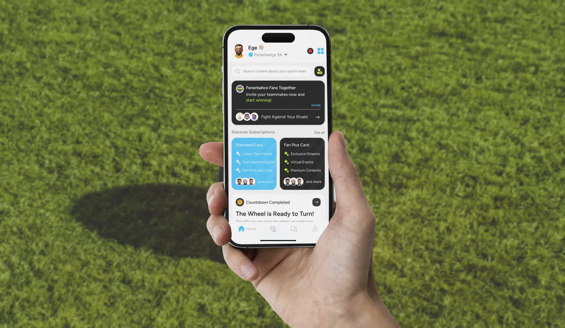
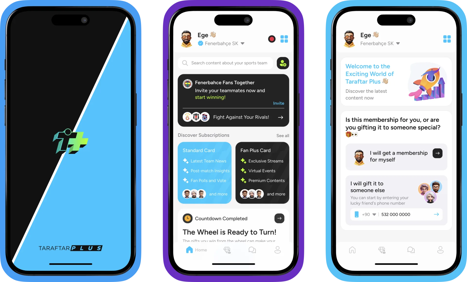
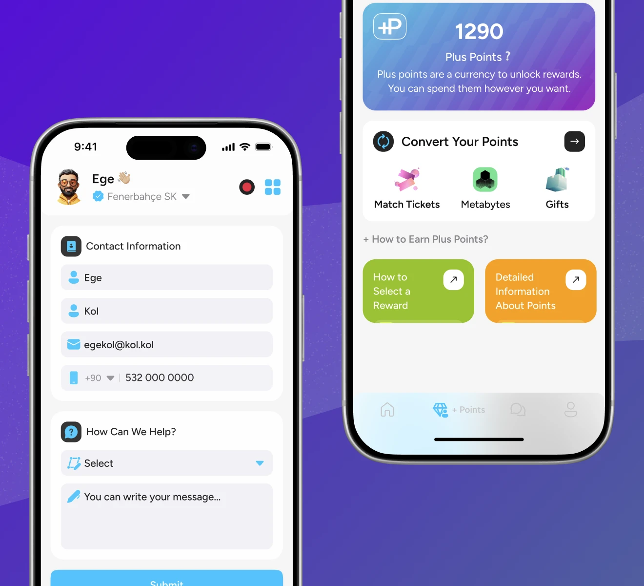
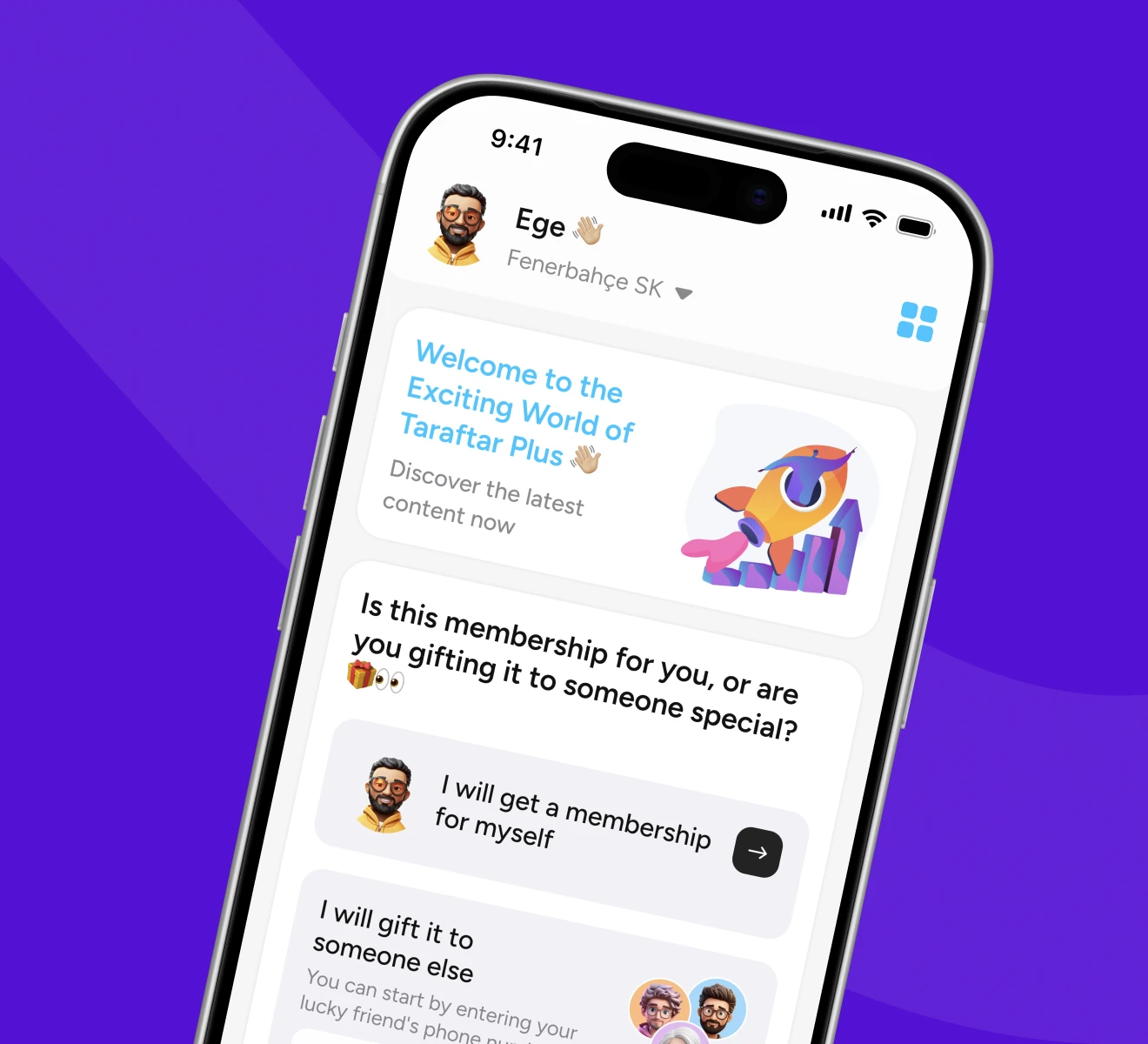
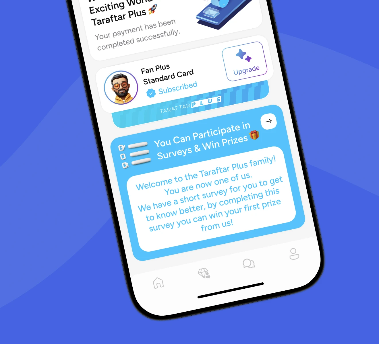
A complete iOS and Android app delivering the full Taraftar Plus experience: personalized club dashboards, live match reactions, prediction games, loyalty points, and community features. The mobile format added push notifications timed to match moments, swipe-based navigation optimized for one-handed use, and a home screen widget showing live match status.
The Challenge
Football fans already have their phones out during a match. The question is not whether they will use an app. It is whether the app earns the screen time over everything else competing for their attention.
Notification design as experience design. Push notifications are the only way to pull a fan into the app at the exact moment they care most. Getting the timing, tone, and frequency right required designing the notification layer as carefully as any screen in the app.
One-handed, glanceable, fast. Matchday use means the phone might be in one hand while the fan stands, cheers, or moves through a crowd. Navigation had to work with a thumb, content had to scan in under two seconds, and actions had to be reachable without shifting grip.
Club identity on a small canvas. The web platform uses expansive layouts to carry each club's color and character. Mobile required translating that identity into compact components: a header color, an icon set, a tone, without losing what makes each club feel distinct.
 Taraftar Plus Mobile: Taking Fan Culture from Screen to Pocket · The Challenge
The Solution
We built the app around the natural timeline of a football match: pre-match anticipation, in-game intensity, and post-match reflection. Every screen was designed for the moment it would most likely be used.
Swipe-first navigation. Rather than a tab bar with five destinations, the app uses a primary swipe flow: club feed, match center, challenges, and profile. The hierarchy is flat, reducing the number of taps to reach any core feature.
Adaptive club theming. Each club has a primary color, a secondary accent, and a badge treatment defined in the design system. When a user switches clubs, the entire shell of the app repaints. The interaction patterns stay the same. The feeling is entirely different.
Push notification architecture. Notifications are segmented by moment: lineup announcement (90 min before kickoff), goal alerts, end-of-match challenge summaries. Each notification deep-links directly to the relevant screen so the transition from notification to content takes a single tap.
 Taraftar Plus Mobile: Taking Fan Culture from Screen to Pocket · The Solution
Experience Highlights
Real-time reactions and predictions at the moment of the match. When a match goes live, the club dashboard shifts into Matchday Mode: a persistent live score banner, a live prediction panel, and a reaction feed from other fans. The design compresses the most active features into a single scrollable surface so fans can participate without switching screens.
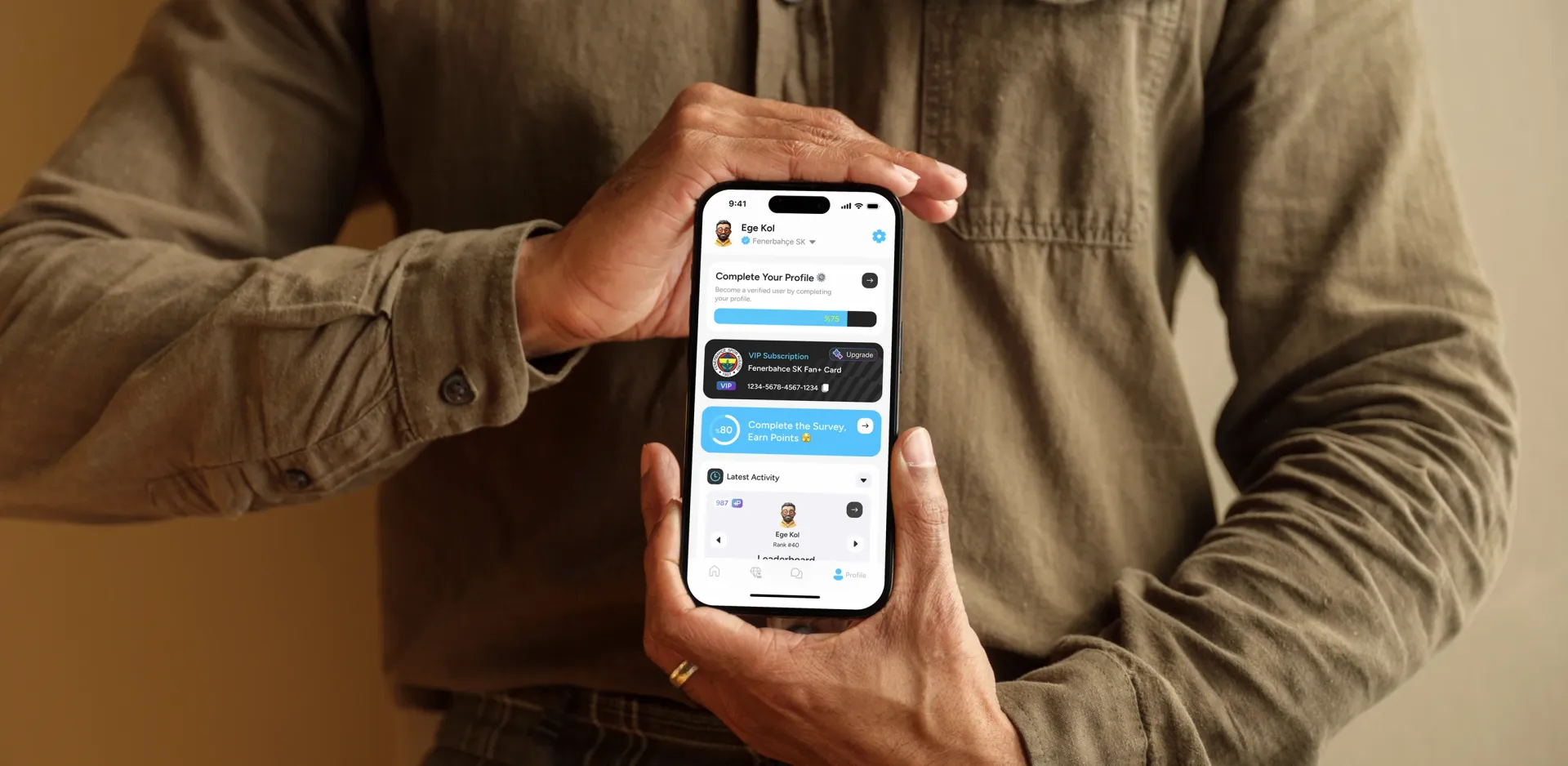
The full club identity in your pocket. Each club dashboard surfaces the content that matters most: today's news, the upcoming fixture, the latest standings, and the fan's current loyalty tier. The layout adapts to whether the club has a match today or not: on matchday the fixture takes center position; on off-days, the feed leads.
Points, rewards, and challenges in pocket format. The loyalty system was redesigned for mobile interaction patterns: a progress ring showing points to the next tier, a daily challenge card with a single clear action, and a rewards shelf showing what is available to redeem. Every loyalty moment is designed to close in a single session.
Design Process
The Experience Loop methodology was applied with mobile-specific constraints at every phase. The primary shift from the web engagement was context: mobile fans are in motion, in crowds, and in moments of peak emotion.
Focus. We reframed the design objective from "replicate the web experience on mobile" to "design for the moments the web cannot reach." That shift changed the feature hierarchy entirely. Push notifications, live reactions, and one-tap loyalty actions moved to the top of the priority list.
Research. We mapped the behavioral difference between fans using the web platform at home and fans using phones at the stadium. Interview data revealed that the highest-value moments were goal reactions and prediction deadlines, both of which happen in under 60 seconds. Design had to support those moments without friction.
Architect. The information architecture was rebuilt from scratch for mobile. The web's sidebar navigation became a swipe-based flow. Deep linking was planned for every notification before the screens were designed, ensuring the architecture could support the notification system rather than treating it as an afterthought.
Make. Prototypes were tested with swipe gestures at actual match events. Club theming was validated by switching between three clubs in a single session to confirm that the identity system held at scale.
Evolve. A shared design token library connected the mobile and web systems, ensuring that when a club updated its brand color on the web platform, the mobile app updated automatically.
 Taraftar Plus Mobile: Taking Fan Culture from Screen to Pocket · Design Process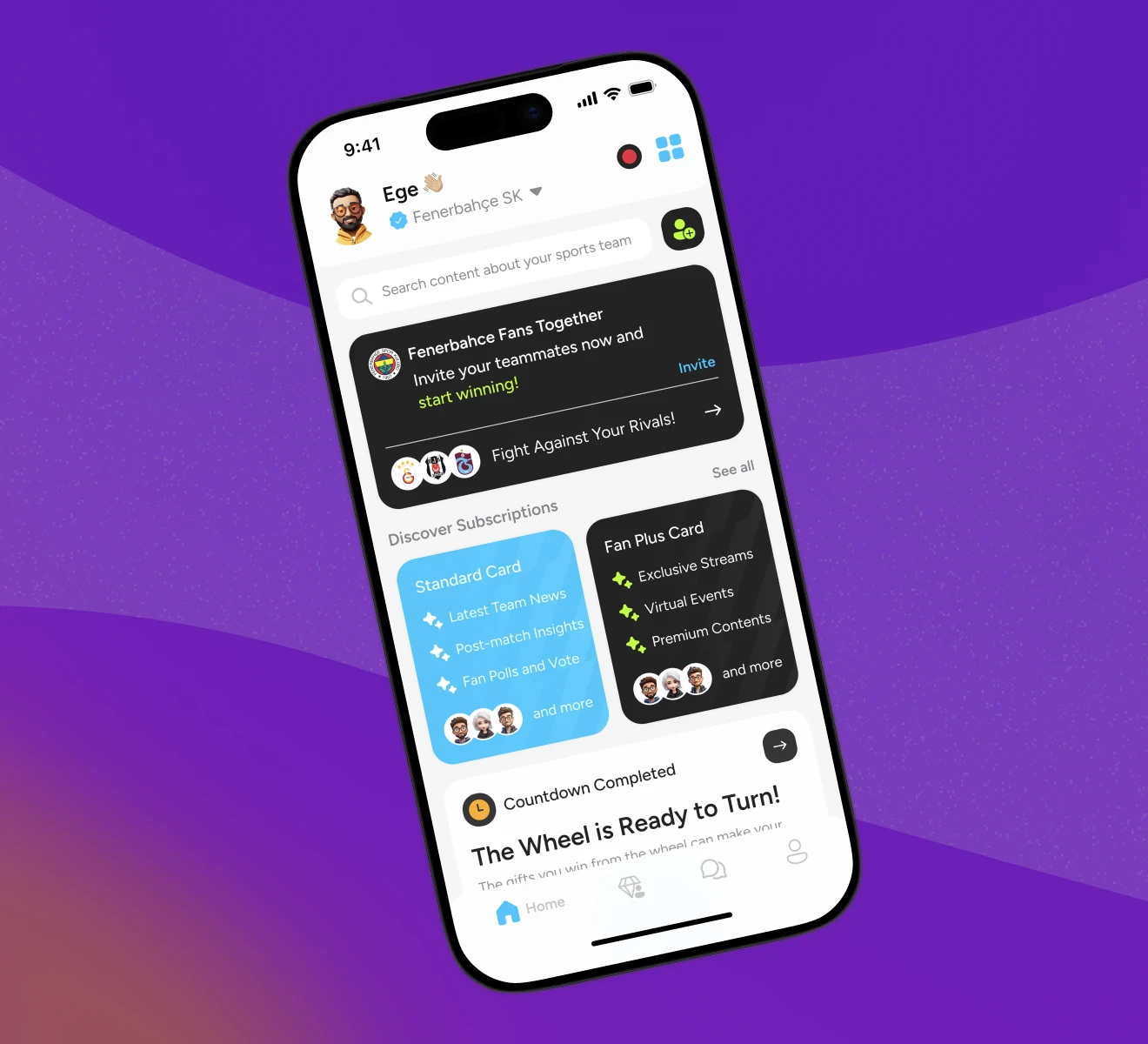
"They were extremely open and positive to communication and revision requests. The team maintained open communication throughout, and their ability to understand the product made them stand out."