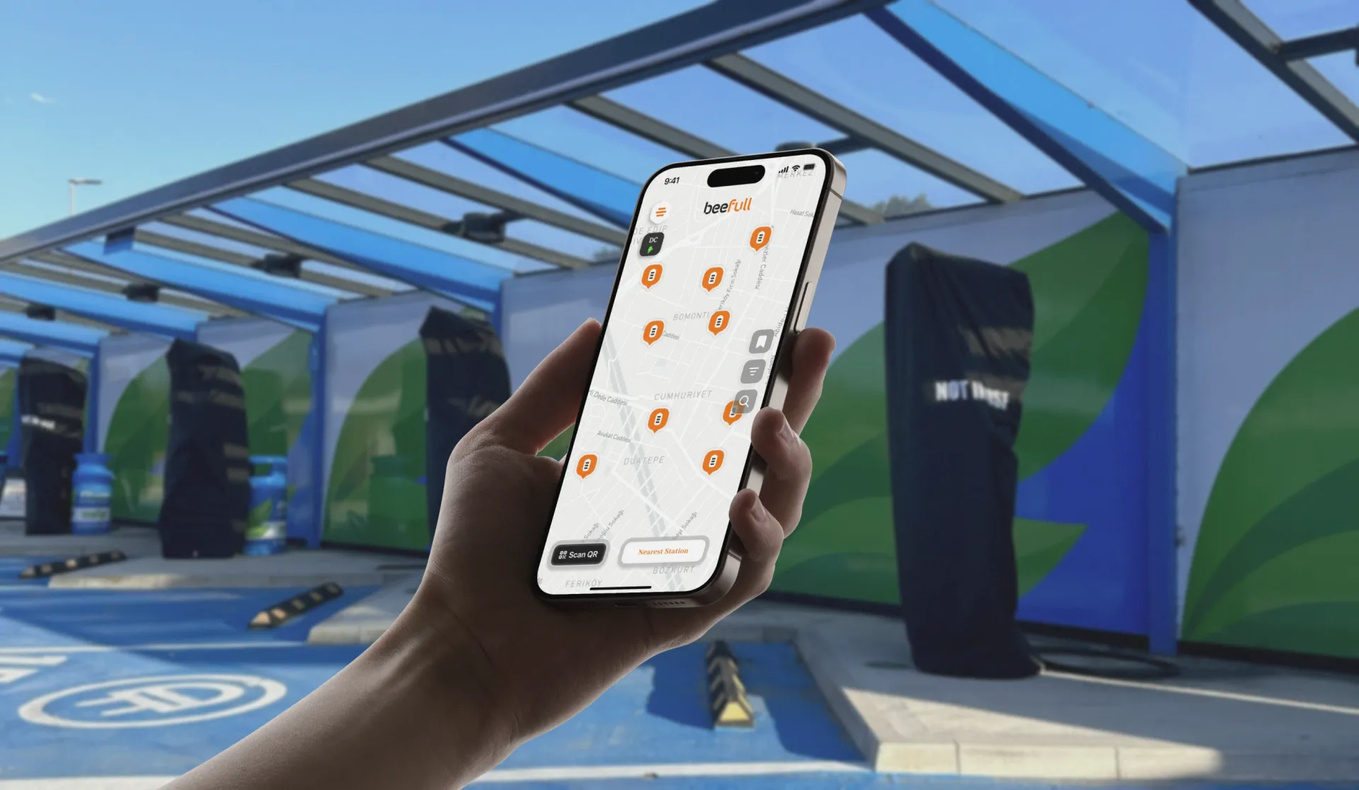
Redesigning a dual-service EV charging and powerbank ecosystem for a unified, data-driven mobile experience.
Blurple partnered with Beefull to redefine how users interact with clean mobility infrastructure. Over six months, we delivered a complete UX and UI redesign for the Beefull mobile app: bridging two distinct journeys, electric vehicle charging and portable powerbank rental, under one consistent and scalable ecosystem.
Beefull runs a nationwide electric mobility network in Türkiye, offering both EV charging and portable powerbank services through a nationwide infrastructure. The goal was to design a unified app experience that could serve two very different user behaviors within the same platform. We focused on improving usability, data feedback, and scalability while aligning the design language with Beefull's modern, sustainable brand vision.
The outcome: a coherent system where EV drivers can locate, reserve, and monitor charging sessions as effortlessly as powerbank users can find and rent devices on the go. The new app makes Beefull one app people reach for twice: to charge a car and to charge a phone.
The Challenge
EV drivers need speed, precision, and real-time data: station availability, route optimization, charging progress. Powerbank users expect instant action: grab, scan, rent, return. Merging these divergent journeys required a flexible design architecture that could preserve clarity while reducing cognitive friction.
Fragmented patterns and scalability gaps. The previous app evolved rapidly as Beefull's network grew, leading to inconsistent navigation, redundant screens, and disconnected visual logic. This fragmentation affected usability metrics and made design-to-development scaling inefficient across both service lines.
Maintaining continuity across use contexts. From highway EV stations to cafés offering portable powerbanks, contextual transitions had to feel fluid. The challenge wasn't just visual unification; it was building mental model continuity across different moments of use.
 Beefull: One App for EV Charging and Powerbanks · The Challenge
The Solution
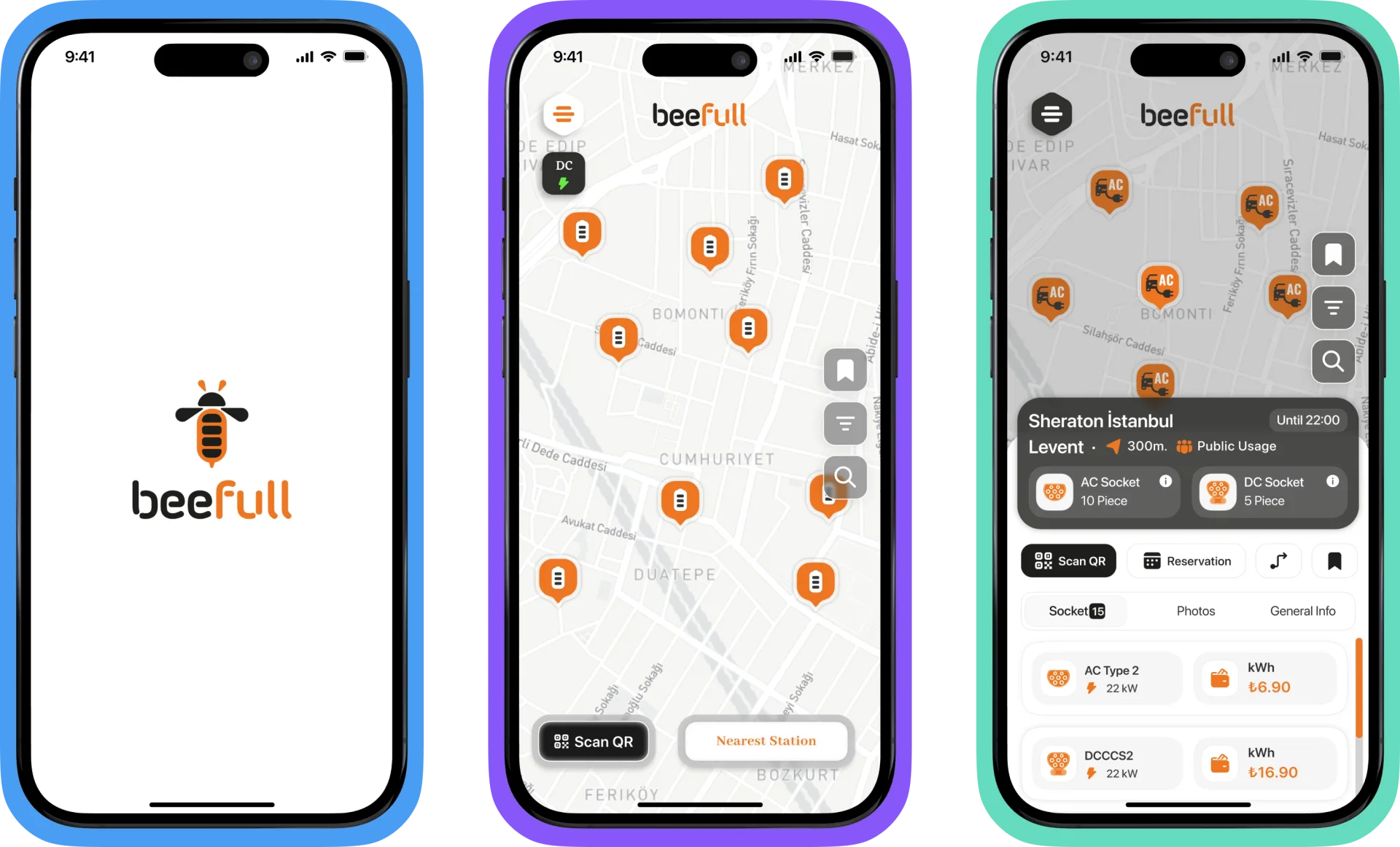
We approached Beefull's redesign as both a unification and transformation effort: not just fixing fragmented journeys, but redefining how users perceive and interact with mobility services.
A data-informed, system-driven approach. We combined behavioral analytics with qualitative insight to reveal shared motivations across EV drivers and powerbank users. This helped us define a common design logic rooted in immediacy, clarity, and trust. Every major flow was reconstructed to reduce friction points and keep continuity between modes.
Designing for modularity and momentum. To scale effectively, we adopted a modular architecture that allowed new services and contexts to be added without redesigning the core. Interaction principles and feedback loops were standardized across the ecosystem, ensuring that the interface felt consistent whether users were on the highway charging or downtown renting.
Bridging brand and performance. Visual identity and usability were treated as a single system. Color, motion, and typography were calibrated for functional clarity and brand energy, translating Beefull's sustainability-focused identity into a dynamic, trustworthy digital experience.
 Beefull: One App for EV Charging and Powerbanks · The Solution
Experience Highlights
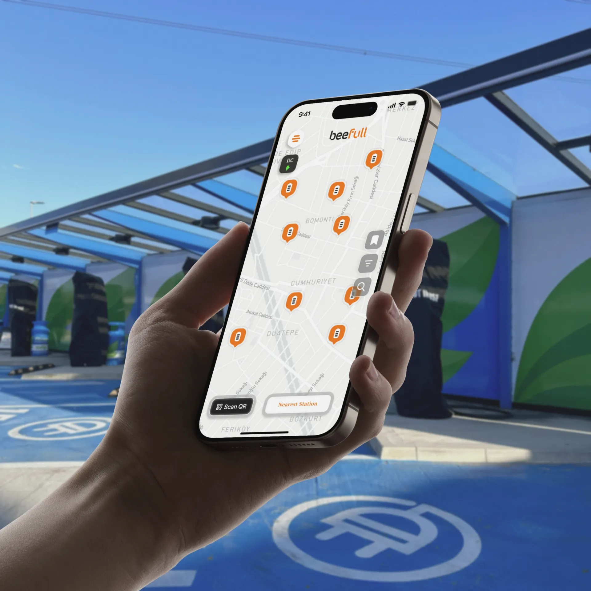
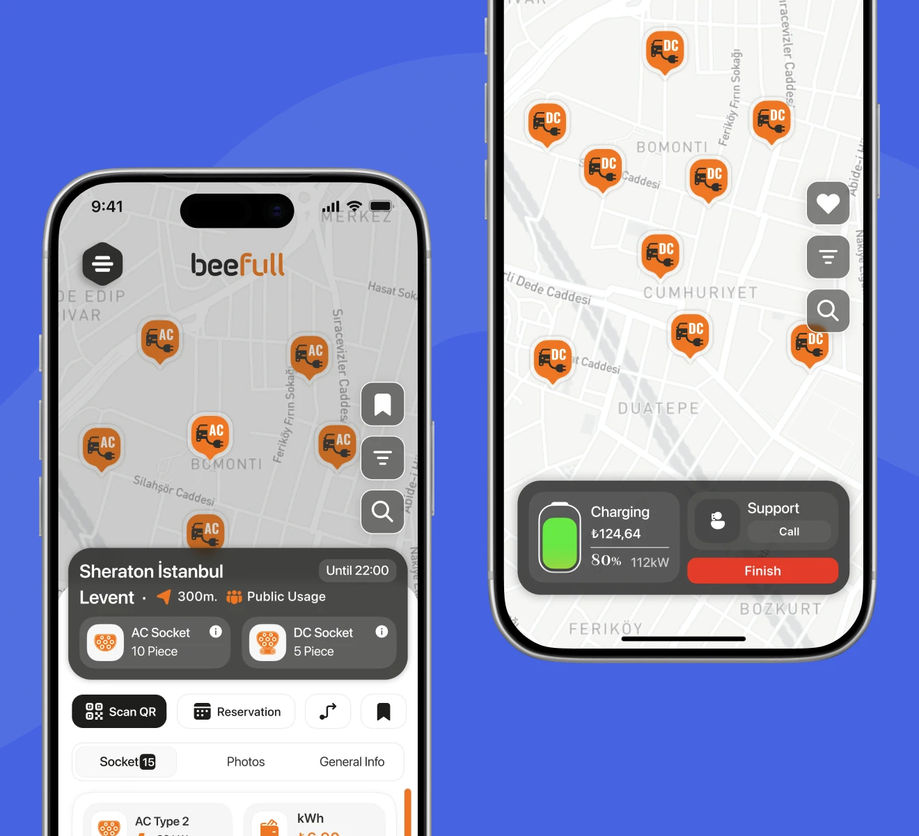
One App, Two Journeys. We designed a flexible experience architecture that serves both EV and powerbank users in a single ecosystem. The modular flow structure allows users to switch between journeys without cognitive friction, maintaining visual and functional consistency.
Insights That Power the Experience. Leveraging usage analytics and real-time feedback, we refined navigation patterns, improved location discovery, and optimized charging and rental processes. Every iteration was shaped by measurable data points to enhance overall efficiency and satisfaction.
Consistency Across 150+ Screens. We developed a scalable design system with reusable components and a unified visual language, enabling Beefull's internal team to rapidly deploy updates and maintain brand coherence across multiple product lines.
 Beefull: One App for EV Charging and Powerbanks · Experience Highlights
Design Process
Our approach followed Blurple's Experience Loop methodology, a structured yet flexible process ensuring every design decision connects back to measurable value.
Focus: Clarifying the opportunity
We defined the problem as: how might we deliver two contrasting services through one intuitive experience without fragmenting brand or logic? Workshops with Beefull's product and engineering teams clarified primary goals: reduce task time, improve retention, and establish a foundation for rapid iteration.
Research: Understanding user behavior and data
Behavioral analysis of EV drivers and powerbank renters revealed overlapping expectations: visibility, trust, and speed. We mapped session data and feedback loops to detect friction points, like long discovery times for EV stations and unclear return confirmations for powerbanks.
Act: Designing a modular ecosystem
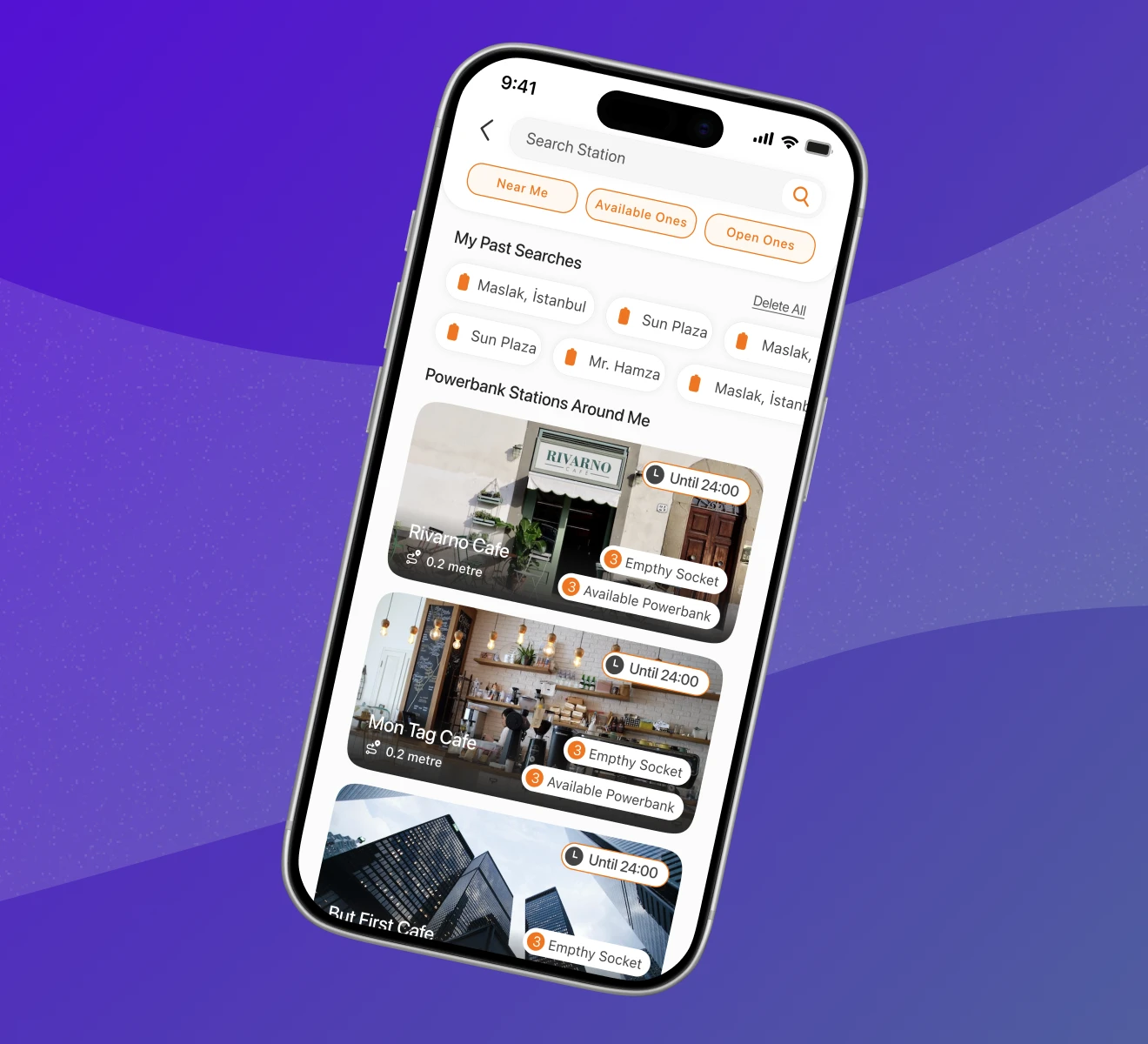
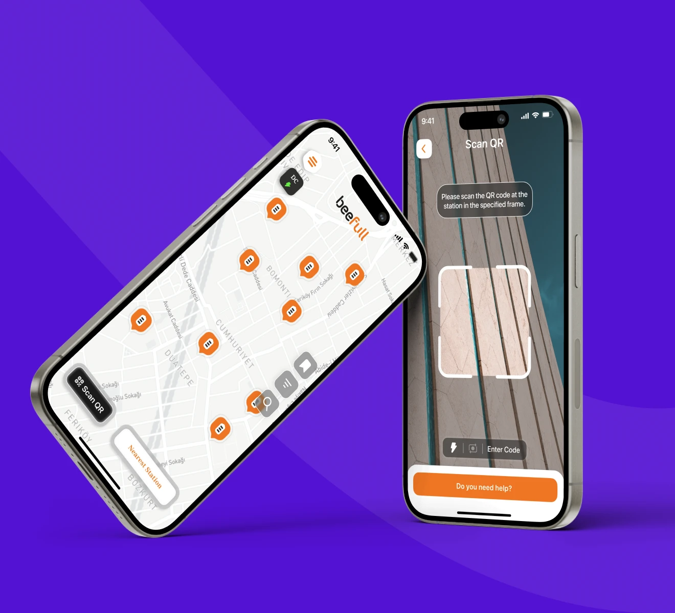
We reorganized the information architecture around core intents: Find, Charge, Rent, Track. That created two distinct but connected journeys. Shared components, such as map surfaces, location cards, and payment modules, ensured consistency and reduced redundancy. Visual rhythm was defined through proximity, hierarchy, and clear feedback patterns.
Act: Building and validating interaction logic
Through rapid prototyping and usability testing, we validated new flows with real users from both groups. Motion and feedback principles reinforced trust: microinteractions signaled every system response, from charger activation to battery return. Visual style was optimized for bright outdoor readability and night mode use.
Evolve: Systematizing and scaling
We established a token-based design system that ensured coherence across 150+ screens. Components were categorized by density (browse vs. live state) and platform parity (iOS/Android). Weekly design–dev syncs kept design intent and implementation in step, while component documentation reduced QA loops.
"Collaborating with the Blurple team was a seamless experience. Their user-centered approach and attention to technical detail allowed us to translate a complex dual service ecosystem into an intuitive, high-performing product. The Beefull app has become a key touchpoint in our mobility network."