Translating a digitally-native bank into its first self-service machine.
Revolut had built one of the most refined digital banking experiences in the world. The next frontier wasn't another app feature. It was making that same experience work in physical space, for the first time, at fleet scale.
Most ATM software is a relic. Revolut is not. The brief was to design hardware-bound flows that felt as fluid, as fast, and as branded as the app itself, inside a public context that fights against all three.
A native banking machine for a digitally-native bank. Now live in Spain, with the first units deployed and expanding. Users can sign up, withdraw, deposit, and collect physical cards from the same kiosk.
The Challenge
A mobile app lives in a private, predictable space: one user, one screen, infinite time. An ATM lives in the opposite: anyone watching, queue forming, lighting unpredictable, multiple languages on the table at once. The challenge wasn't replicating the app's function. It was preserving its feeling.
A trust gap, not a feature gap. Revolut's app already does most of what a banking machine needs to do. What an ATM has historically failed at is the part Revolut is best at: clarity, speed, and the sense that the system is on your side. That gap was the project's real surface area.
Brand consistency at hardware scale. Every motion, microcopy choice, and transition had to read as Revolut from the first touch. Not on a 6-inch phone, but on a 32-inch portrait screen, with a different physical posture, viewing distance, and ambient noise.
A multilingual public surface. Spain alone meant Catalan, Spanish, and English in steady rotation. Default hierarchy, fallback logic, and language-switch UX had to feel native, not bolted on.
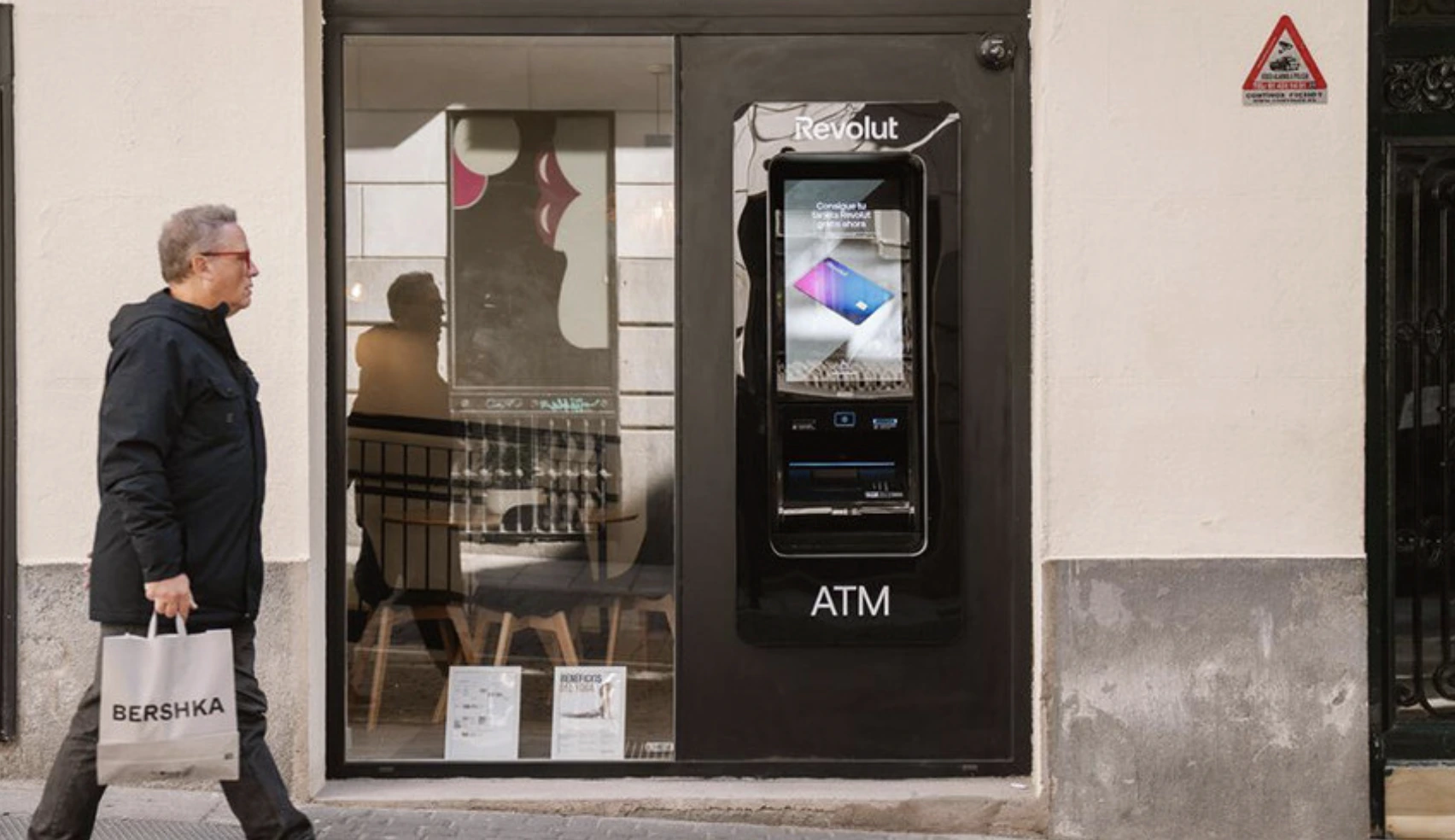
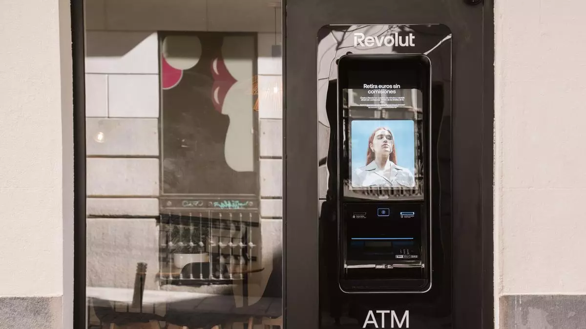 A pedestrian walks past a Revolut ATM installed in a Madrid storefront
The Approach
We structured the engagement in three connected phases. None of them were about adding features. Each one earned the next: audit, then system, then hardware.
Phase 01, PX-RAY. Before touching the kiosk, we audited Revolut's existing mobile and onboarding surfaces with our diagnostic service. AI-augmented heuristic review, behavioral pattern mapping, and accessibility benchmarking gave us a baseline of where the brand's experience held coherence, and where it lost it. The output wasn't a list of fixes. It was a map of what to protect, and what to rebuild, when translating the brand to a new surface.
Phase 02, Information architecture for a new context. We rebuilt the flow logic from scratch, not as a port of mobile screens but as a re-architected experience for a portrait kiosk. Hero content top. Primary action mid-screen. Controls within thumb-zone reach. Onboarding, withdrawal, and card collection were each restructured around the realities of a public, time-pressured context: shorter steps, louder feedback, fewer assumptions about what the user already knows.
Phase 03, System, motion, and microcopy. Day and night modes, high-contrast states, language switching, and screen-reader compatibility were treated as core, not optional. Every transition was tuned to feel like Revolut at the first touch, from the idle attract state through the keypad behavior to the way the screen breathes between steps. AI played a quiet role across the system: from accelerating the audit to surfacing accessibility regressions, it ran underneath the work, never on top of it.
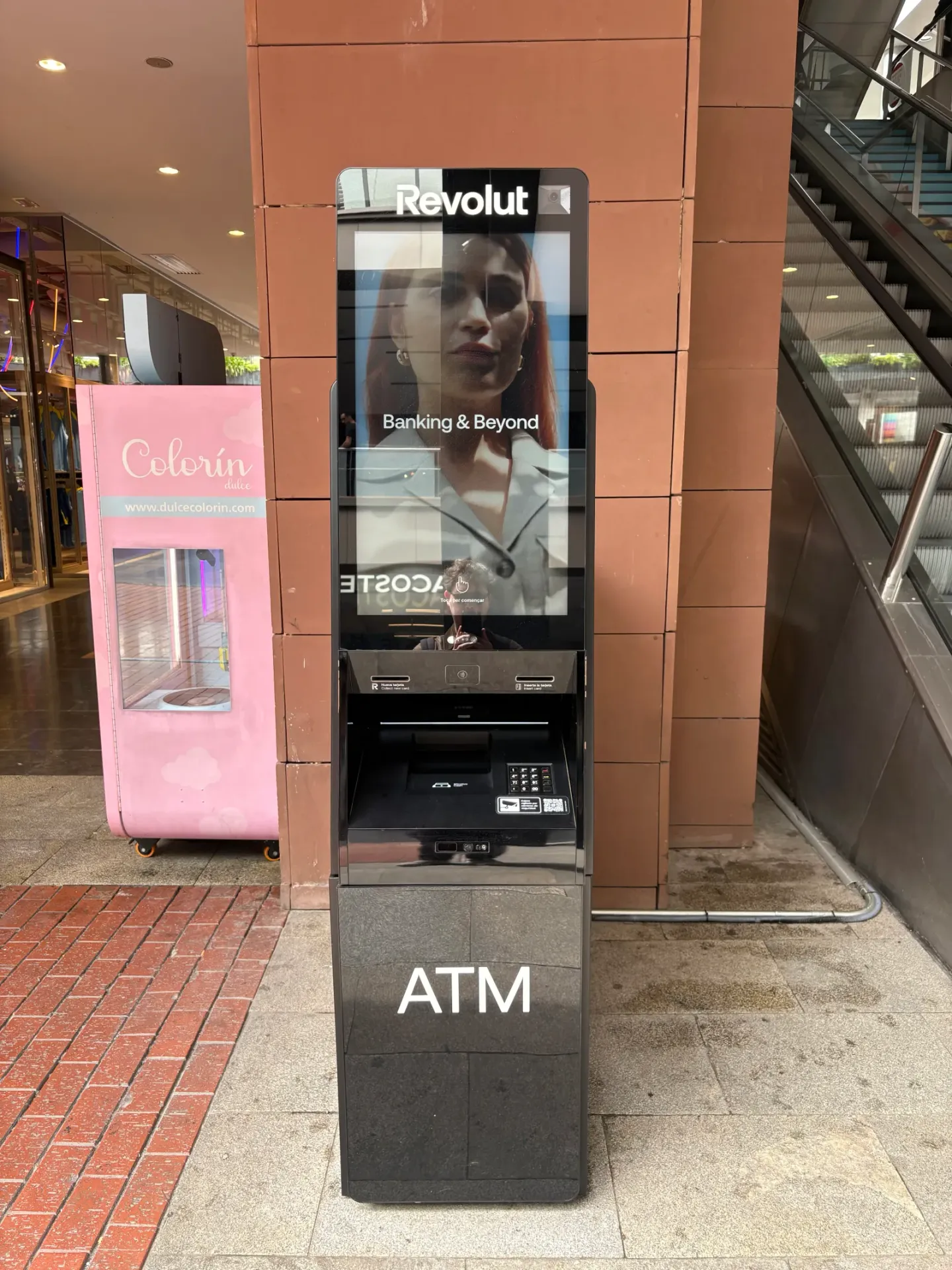
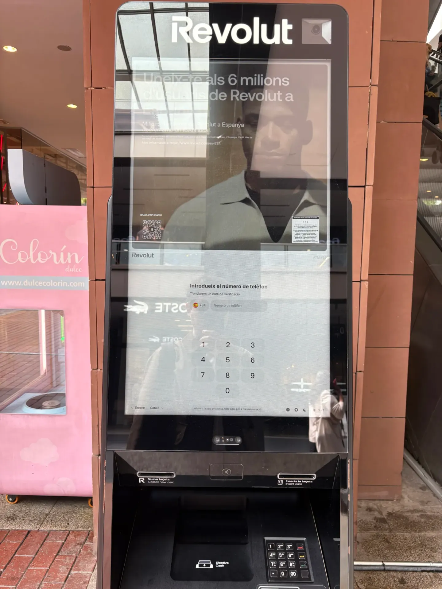 Revolut ATM displaying the Banking & Beyond idle attract screen in a shopping centre
The Outcome
The Revolut ATM is now live across Spain. A first-time user can sign up to Revolut at the machine itself, by phone number, with no card required. For Revolut, it's a physical extension of a digital identity that scales across markets, languages, and hardware revisions. For users, it's the first time using an ATM has felt like using the brand they already trust.
The brief, in one line: take a digital-native experience into the street without losing what made it good.
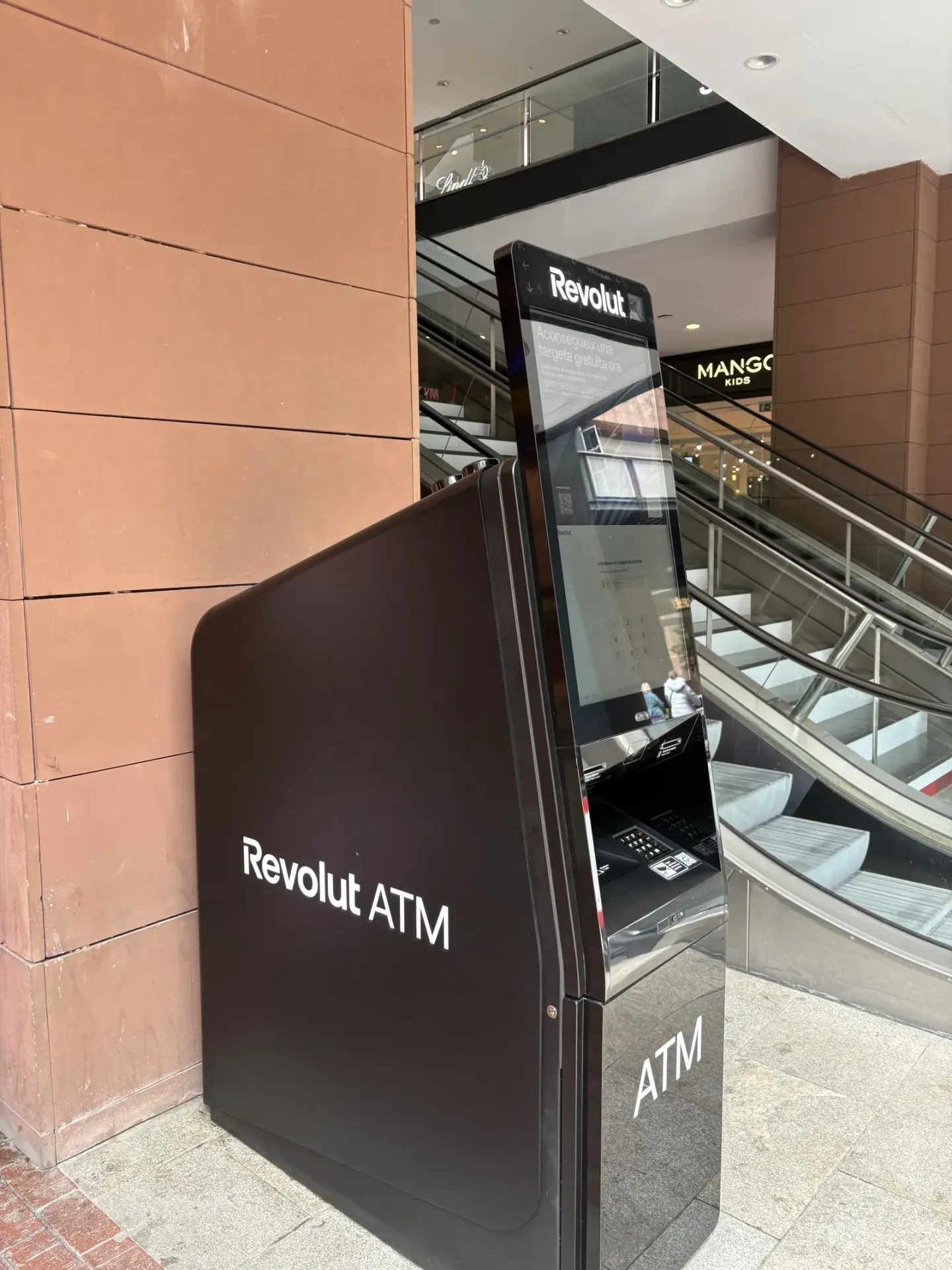 Side angle of the Revolut ATM kiosk, with shopping centre escalator in the background