Travelers didn't fear the price of data. They feared not knowing what happens next.
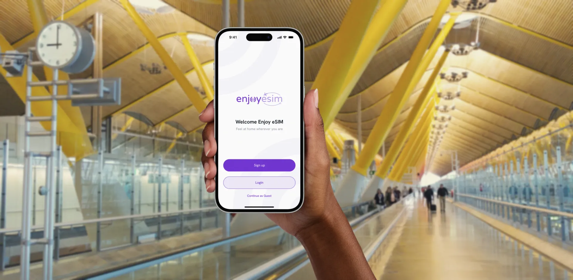
Staying connected abroad should feel simple. Yet for many travelers the promise of digital eSIMs came wrapped in uncertainty: technical jargon, unclear steps, and hidden variables across devices and carriers. Enjoy eSIM helps people connect instantly in over 190 countries, but the convenience was trapped behind friction.
The brief was bigger than a redesign. Enjoy eSIM needed a way to translate technology into trust.
Trust, not simplification
We began by redefining the goal: not "simplify eSIM" but "help travelers trust eSIM." In early workshops we mapped the emotional curve of a typical user: excitement before travel, anxiety during setup, relief at connection. That map became the north star, and it reframed every later decision around one idea: every traveler deserves to feel certain, even in a foreign network.
Listening beyond usability
Quantitative data from Firebase showed exactly where confusion peaked, and qualitative interviews explained why. Drop-offs during activation were high, not because the product failed, but because communication did.
 finding where confusion peaked in the activation journey
Progressive clarity
We rebuilt the product around a single three-step logic: Discover, Purchase, Activate. Each phase carries orientation cues, headers, icons and microcopy, so users always know where they are. Every interaction, from selecting a plan to scanning a QR code, provides a sense of "I know what's next."
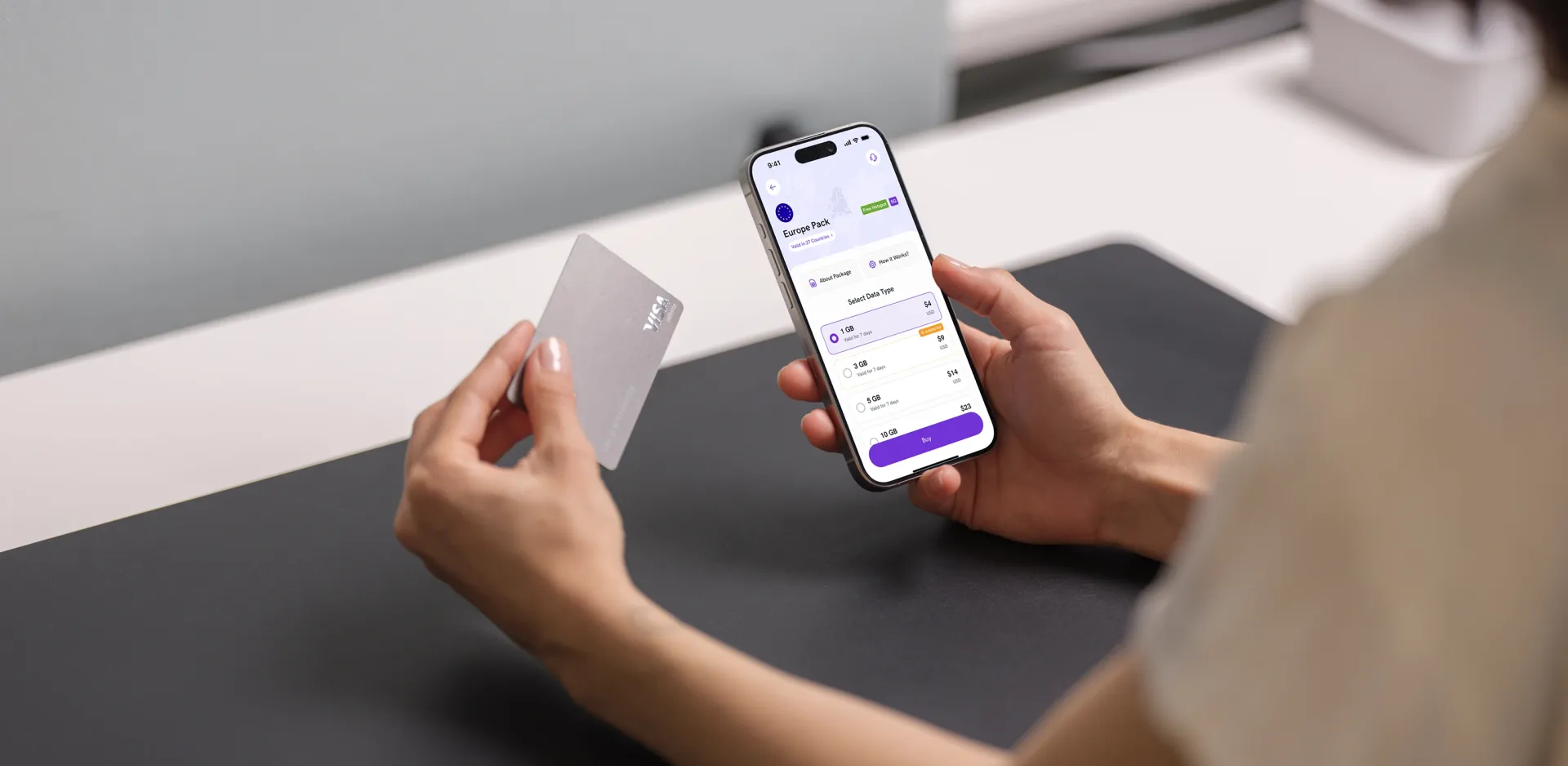
Each finding got its answer. Hesitation became modular plan cards that adapt to regions, currencies and data options, making comparison effortless. Silence became feedback everywhere: behavioral cues instead of technical terminology, contextual helper states, and error states that are soft, instructive and reversible. Local nuance became a token-based design system that adapts to localization, right-to-left languages and platform conventions.
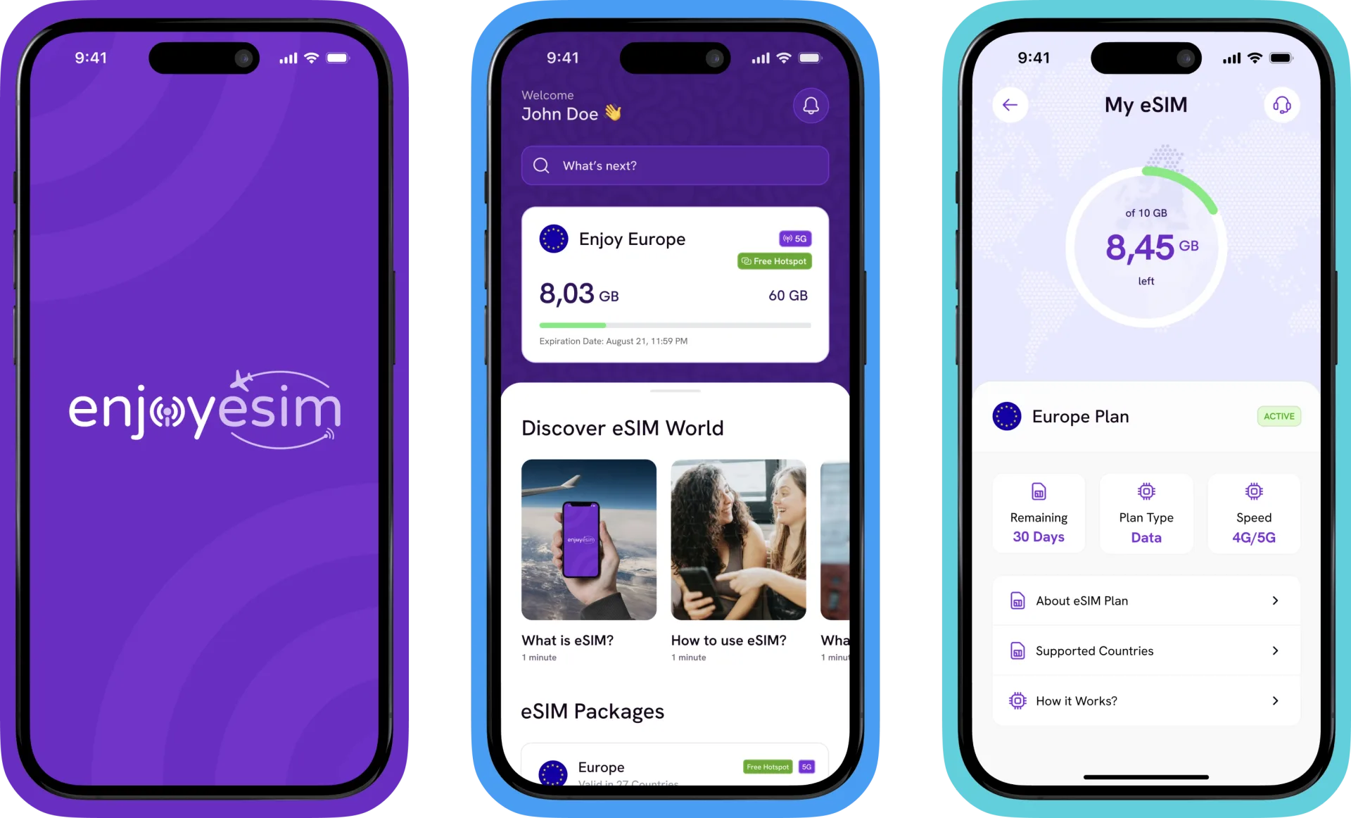 Discover, Purchase, Activate: one three-step logic
Tested on hesitation, not opinions
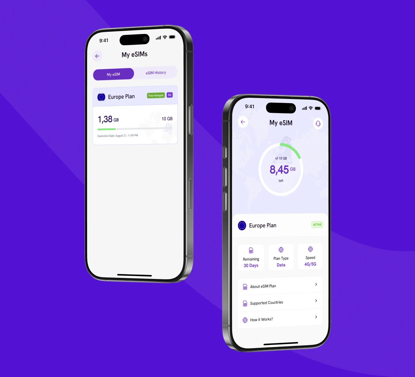
Rapid Figma iterations let us test micro-interactions before layout. We put prototypes in front of real travelers across four countries and iterated around their moments of hesitation rather than their opinions. Animation and haptics became communication tools; success states now feel rewarding, and a clean dashboard gives real-time usage tracking and easy recharges.
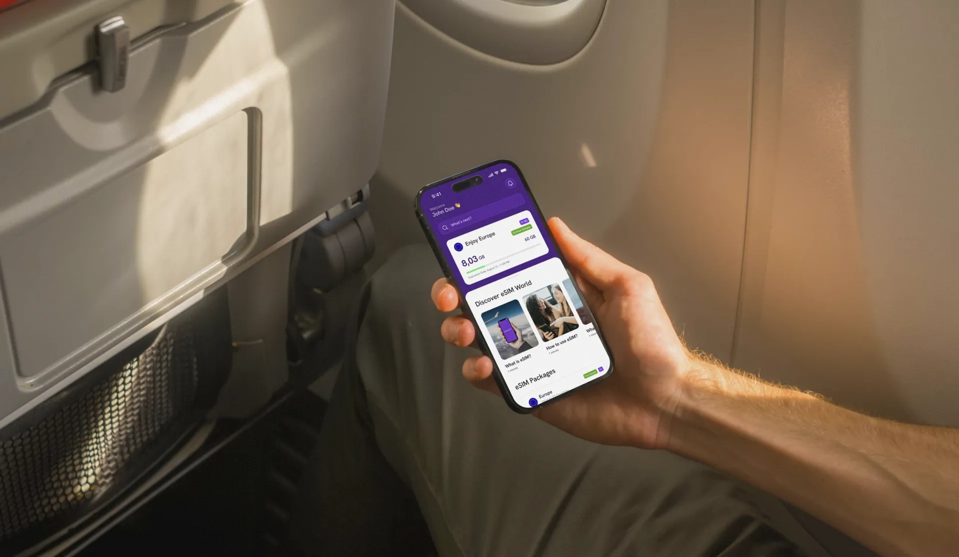
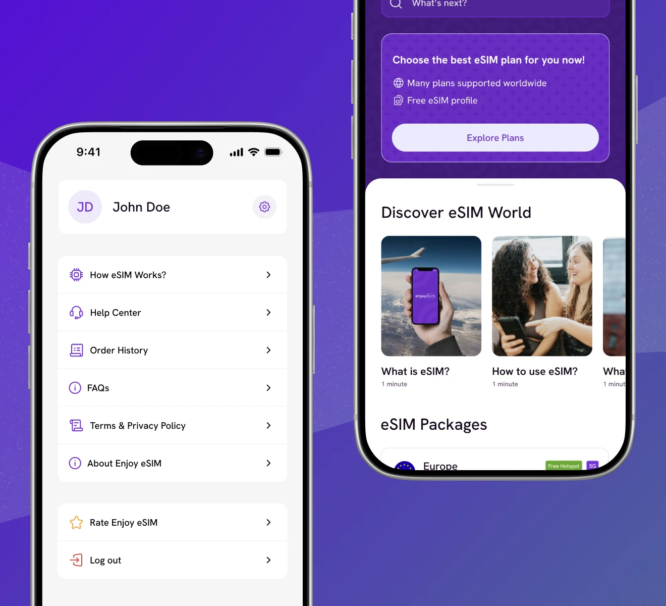
 real-time tracking and control during travel
A system that scales with the map
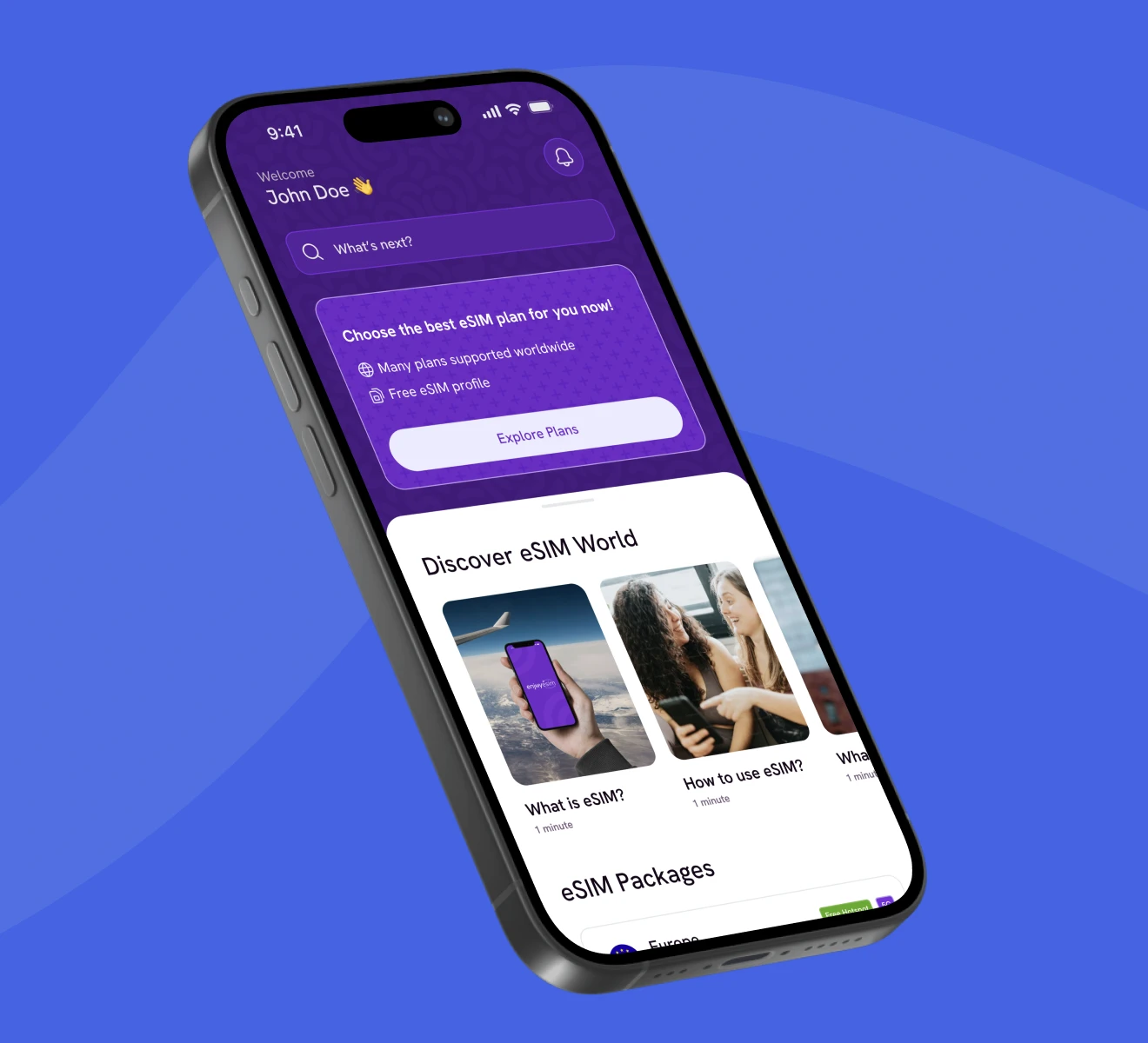
Shared component libraries shortened design-to-dev turnaround, and weekly design and dev syncs keep the system evolving as Enjoy eSIM expands into new markets. After the redesign the numbers followed: a 35% increase in customer acquisition, a 40% rise in returning users, and a 25% reduction in customer support needs.
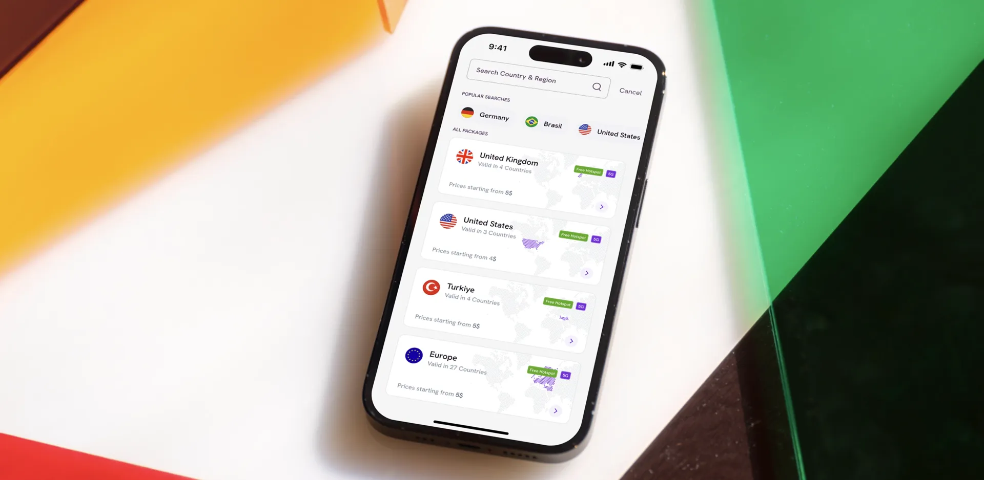 the redesigned Enjoy eSIM experience in production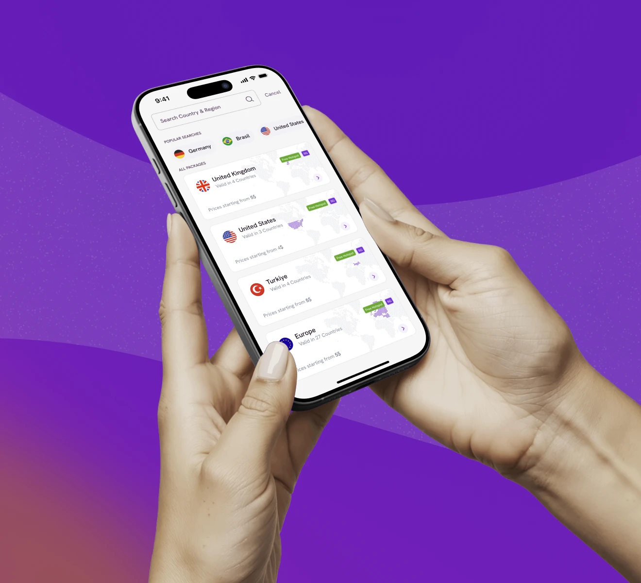
"They consistently went the extra mile to ensure every detail was not only addressed but thoughtfully refined. Their proactive approach gave us confidence at every stage, knowing that nothing was left unresolved."