Cumhuriyet Web Experience: Redesigning a Century-Old Voice for the Digital Age
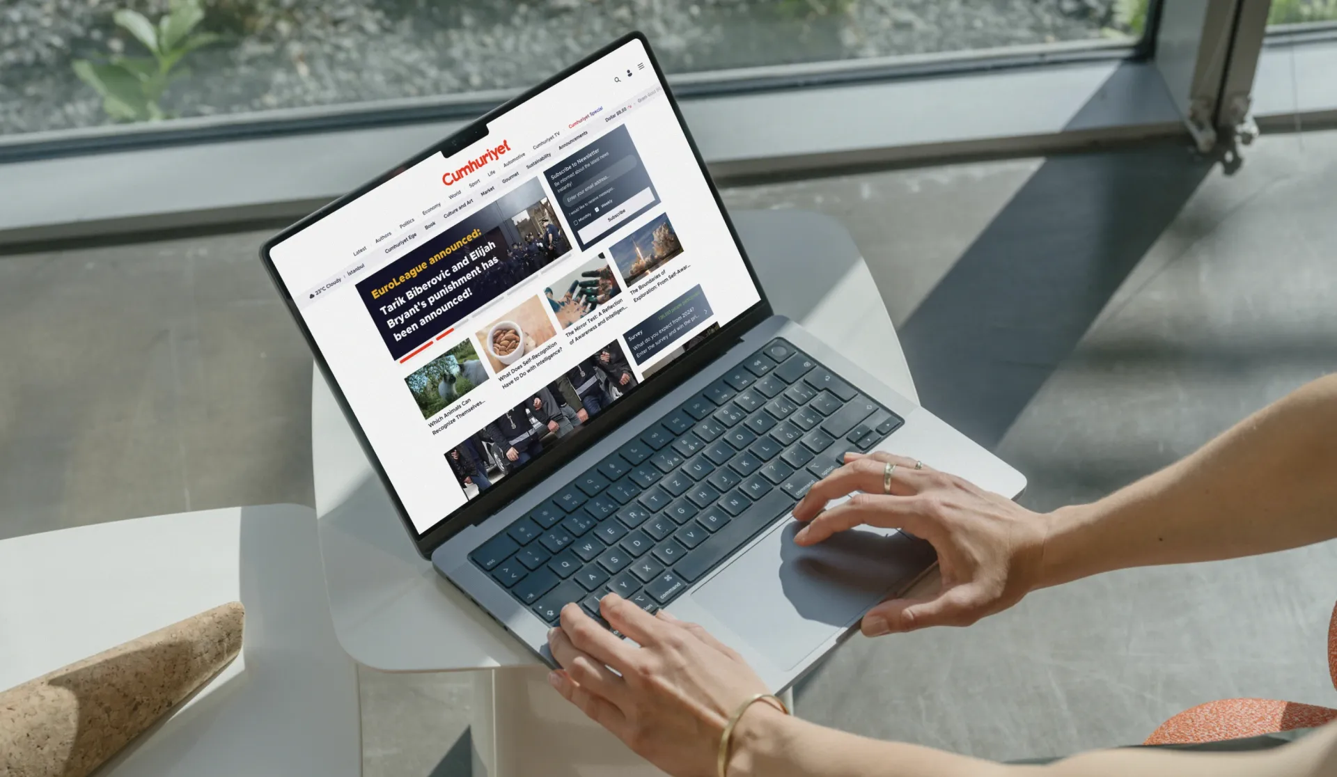
A complete digital redesign for Türkiye's most enduring newspaper, serving 5 million daily readers.
Cumhuriyet Gazetesi has been at the heart of Turkish public life since 1924. As one of Türkiye's most visited news websites, with 5 million daily unique visitors, the digital experience needed to match the weight of the institution it represented. Blurple was commissioned to redesign the entire web experience, from information architecture and editorial templates to ad integration and reader engagement systems.
A news website serving 5 million daily visitors carries two kinds of responsibility: editorial and commercial. Every design decision had to serve both at once. Content needed to be discoverable across dozens of categories. Revenue from advertising had to be preserved without compromising the reading experience. And a 100-year-old brand identity had to translate into a modern digital interface without losing its authority.
A fully redesigned web experience now live on cumhuriyet.com.tr, handling one of the highest-traffic editorial environments in Türkiye. The new design serves readers across news, lifestyle, sports, sustainability, automotive, culture, and more, with unobtrusive ad integration and a newsletter subscription system that grows Cumhuriyet's direct reader relationship.
The Challenge
Redesigning a major news website is unlike any other digital product challenge. The scale is massive, the content is infinite, and the stakes are institutional. Cumhuriyet is not just a news source. It is a century-old public institution with millions of loyal readers who bring expectations built over decades.
Information architecture at news scale. The site carries dozens of editorial sections, from Politics, Economy, and World to Gourmet, Sustainability, and Culture. Each needed its own template logic while sharing a coherent visual system. Readers needed to orient themselves instantly, regardless of which section they landed in.
Advertising as part of the design, not an afterthought. Cumhuriyet's digital revenue depends significantly on display advertising. Standard ad sizes had to be integrated into the layout in ways that felt considered rather than intrusive. Ad slots needed to be performant for advertisers while not breaking the editorial reading flow.
A 100-year brand in a modern interface. The Cumhuriyet red and the brand's editorial authority had to carry through into a digital design language without feeling like a legacy site or a generic news template. The balance between institutional weight and contemporary readability was the project's central design challenge.
 Cumhuriyet Web Experience: Redesigning a Century-Old Voice for the Digital Age · The Challenge
The Solution
We approached the redesign as a system design problem. The solution was not a single homepage but a modular framework of editorial components that could be assembled differently across sections, content types, and page templates.
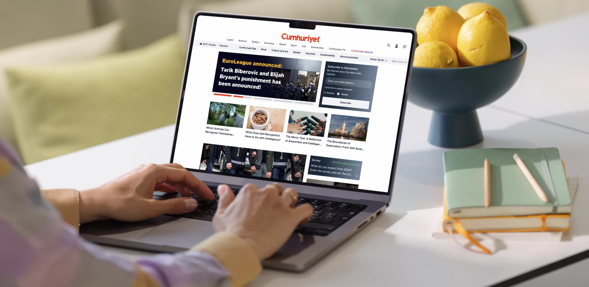
A content-first navigation architecture. The primary navigation carries readers into sections by interest: Latest, Authors, Politics, Economy, World, Sport, Life, Automotive, Culture and Art, Market, Gourmet, Sustainability, and more. A secondary row for Cumhuriyet TV, Book, and editorial specials keeps the brand's broader media ecosystem visible without competing with news content.
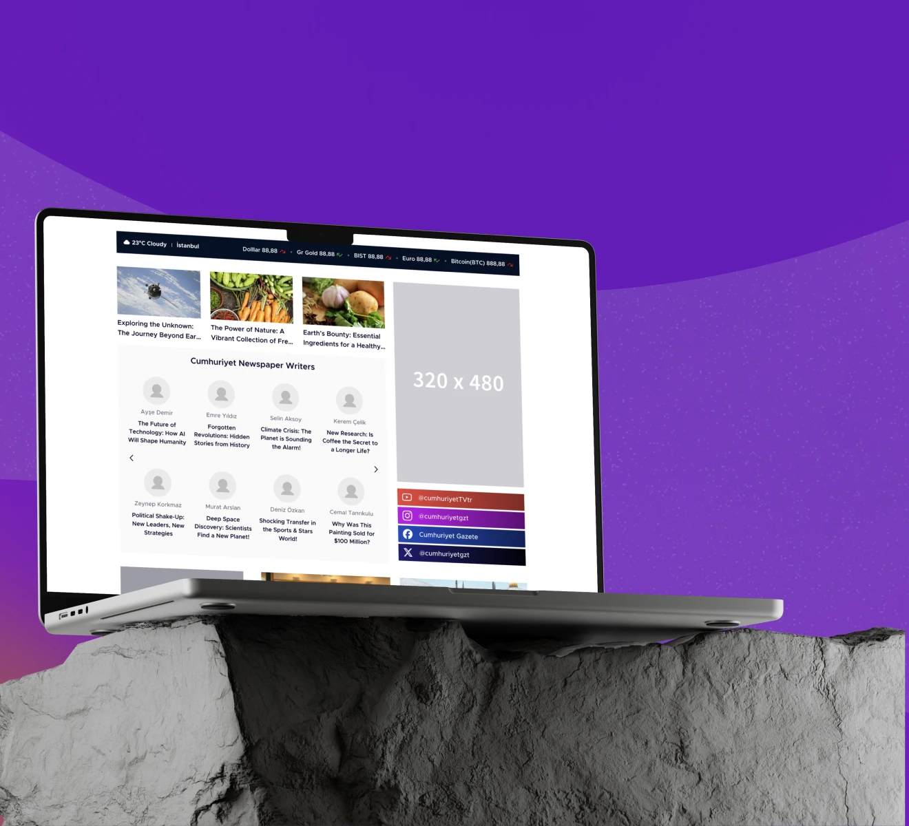
The homepage as an editorial instrument. The hero section features a prominent breaking news unit with bold typography and contrasting color, giving editors a flexible canvas for the most urgent story of the moment. Below it, content modules adapt to story type: photo-led features, text-forward summaries, author-bylined stories, and survey prompts for reader engagement.
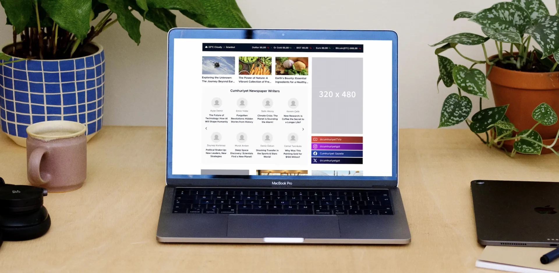
Author visibility as a trust signal. The Cumhuriyet Newspaper Writers section surfaces journalists by name and story, reinforcing the brand's editorial identity and encouraging readers to follow individual voices rather than just categories.
Real-time context at the top. Weather, currency rates (Dollar, Euro, Gold, BIST), and cryptocurrency prices run in a live ticker above the navigation, providing immediate contextual value to readers before they engage with any content.
 Cumhuriyet Web Experience: Redesigning a Century-Old Voice for the Digital Age · The Solution
Experience Highlights
Editorial Category Templates
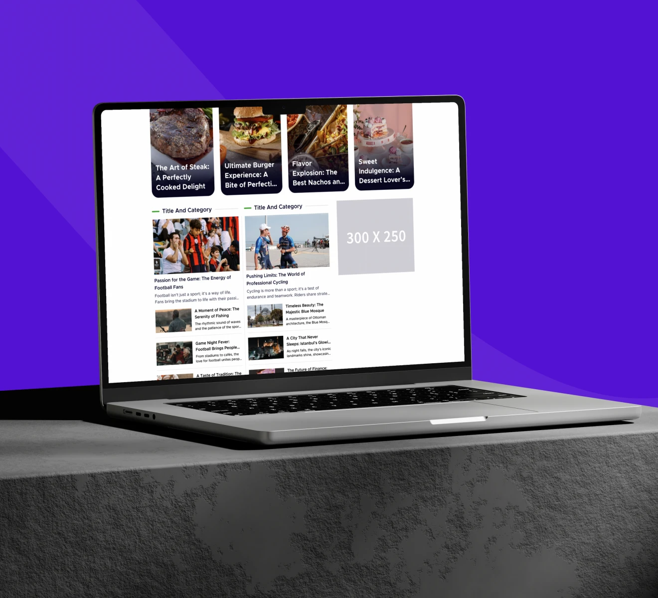
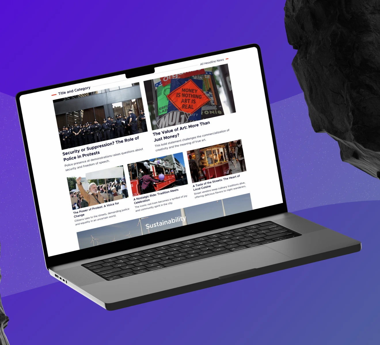
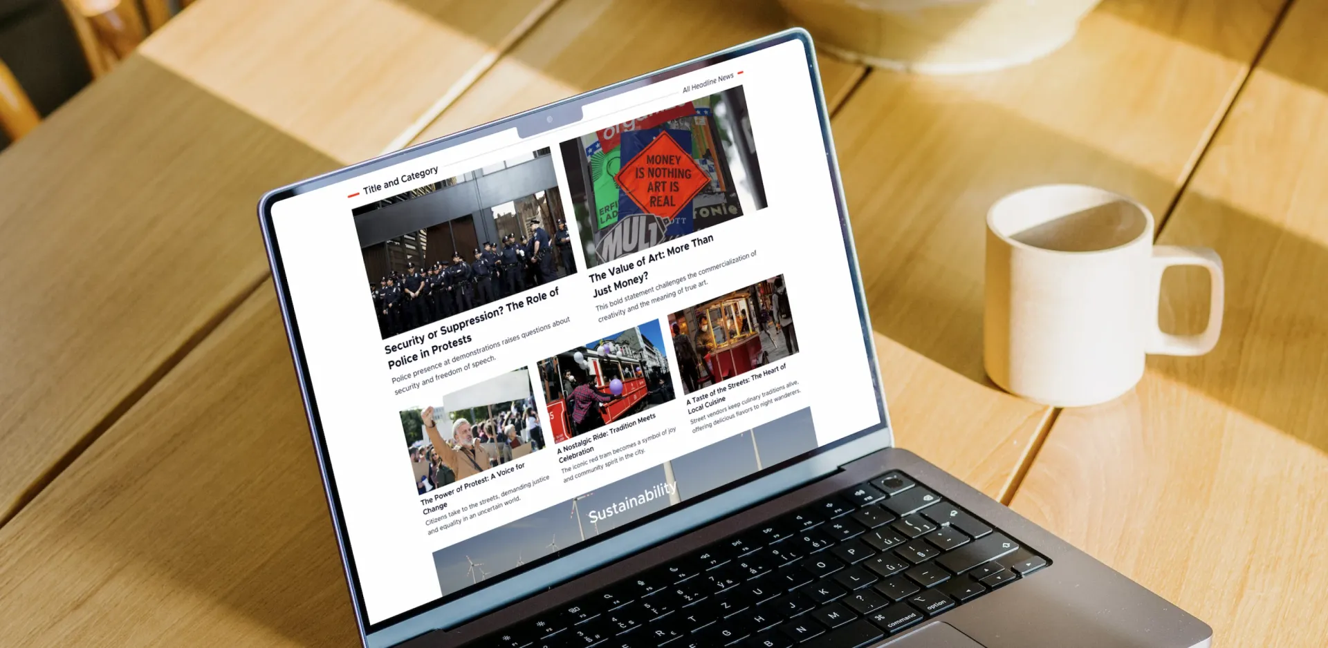
Each content section uses a consistent grid structure that prioritizes the strongest image and headline, then cascades into supporting stories. The layout communicates visual hierarchy without requiring editorial judgment to be overridden by algorithmic ranking.
Newsletter Subscription Module
Directly integrated into the homepage layout, the newsletter module captures reader intent at the point of engagement. Readers choose between monthly and weekly delivery, creating a sustainable direct-to-reader channel outside of social media platforms.
Sustainability and Themed Sections
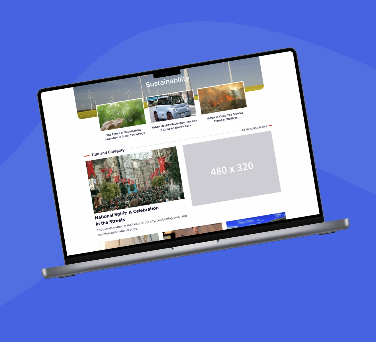
Category sections like Sustainability use full-width visual headers to establish editorial character before the content begins. This gives Cumhuriyet's topical verticals a distinct identity within the broader site, supporting both editorial depth and brand extension.
Ad Slot Integration
Display advertising placements are structured into the layout grid rather than overlaid on content. This ensures ad performance for commercial partners while keeping the editorial experience readable and uninterrupted.
 Cumhuriyet Web Experience: Redesigning a Century-Old Voice for the Digital Age · Experience Highlights
Design Process
Designing for Cumhuriyet required moving carefully. At 5 million daily unique visitors, every interface decision carries consequences that compound across millions of interactions.
Focus: The north star was editorial clarity at scale: every reader, regardless of which page they land on, should immediately understand where they are and how to find what they need. We aligned all stakeholders around this definition before beginning visual work.
Research: Analysis of existing reader behavior, content consumption patterns, and competitive benchmarking across leading news sites informed the information architecture. Particular attention was paid to how readers navigate between categories, how far they scroll, and where drop-off occurs.
Act: We built a modular component library organized around content types rather than page types. Story cards, featured articles, category headers, author bylines, ad slots, and engagement modules were each designed independently before being composed into page templates.
Measure: Prototypes were tested against representative content samples across Politics, Sports, Life, and Gourmet to validate that the system worked equally well for text-heavy news as for image-driven lifestyle content.
Evolve: The design system was delivered with comprehensive documentation, enabling Cumhuriyet's internal teams to extend it into new sections and content types without breaking the visual coherence of the platform.
Cumhuriyet Web Experience: Redesigning a Century-Old Voice for the Digital Age · Design Process