Health decisions start with fear. Good design answers it.
A patient booking treatment in another country trusts a website before they ever trust a doctor. Dentakay's global platform, six languages and millions of monthly visitors, and Doctic's health platform were designed for exactly that leap.
The patient reads the pixels before they meet the doctor
In health tourism the website IS the clinic's handshake: prices that don't hide, doctors with faces, treatments explained before the flight is booked. We design that handshake.
Trust before travel
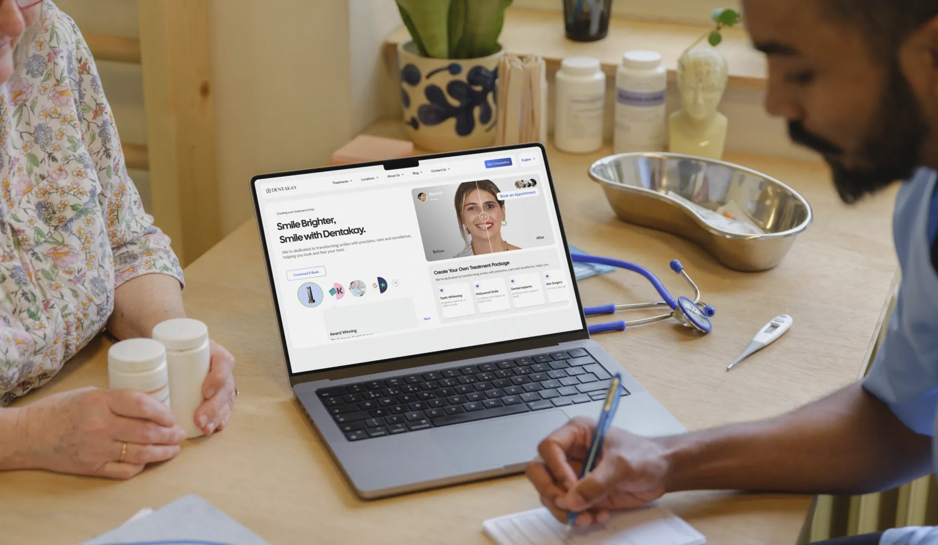
A Dentakay patient decides on a new smile from London or Riyadh, for a chair in Istanbul. Six languages, transparent treatment pages and real proof carry that decision; the result is conversion at genuinely global scale.
When the patient flies in, nothing can hide in translation. The page they read has to be the clinic they meet.
Domain obsession, verified
Doctic's team put it best: "In the end, they had more information and interest in our product than we did." That is what health products need from a studio: obsession with the domain, not just the screens.
We read the clinical flows, the consent forms, the follow-up protocols. Then we design.
Calm is a feature
Health interfaces carry anxious readers: no countdown timers, no dark patterns, no tricks. Clear prices, clear steps, clear outcomes.
In most industries a dark pattern is a growth hack. In health it is harm, and it always shows up in the reviews.
The receipts
Questions we actually get
What health experience does blurple studio have?+
Dentakay, a global dental tourism platform redesigned for conversion at scale, plus healthcare-grade accessibility work through our A11Y-RAY practice.
Can you design for patients who are stressed or unfamiliar with technology?+
That's the discipline health demands: calm flows, plain language and accessibility as a default, not a feature.
Do you handle conversion for treatment platforms?+
Yes — Dentakay's redesign focused on turning international interest into booked treatments without dark patterns.
Building in health?
Bring the problem, not the brief. We'll show you where anxious users drop out, and what we'd ship first.